
Copywriting and web design, coming together to make a landing page, is an art and a science.
Words, elements, color, and style work together toward helping visitors find exactly what they’re looking for—while conveying only the most important information and navigation.
Let’s look conversion hacks from 30 of (subjectively) the best landing pages online.
They’re numbered, but not in a particular order.
1. Pit Viper
Page URL: https://www.pitviper.com
Pit Viper is a performance eyewear company that decided to set itself apart from the other brands by adding a strong dose of personality to its product’s design and brand identity.
This paid off, and Pit Viper went from being a two-person operation that used crowdfunding to get started, to a nationwide operation that now has over 50 employees and a 7-figure yearly revenue.
Their landing page reflects the brand’s identity, and within seconds, you’ll know who their customer is and how they live their lives.
Favorite line or element:
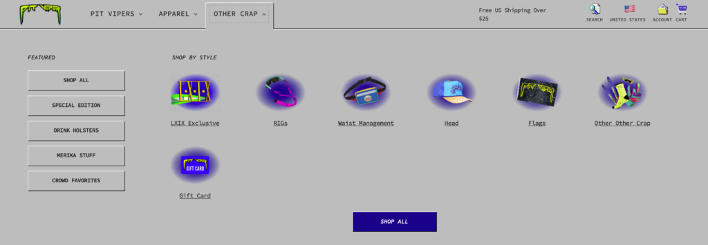
Honestly, Pit Viper tackles the problem of having multiple product categories beautifully.
They make searching fun by using that vintage Windows ‘98 style and even creating new terms for products. (See “waist management” instead of “fanny packs.”)
Why the page works:
- The brand identity instantly stands out. As a PitViper customer, you’ll immediately feel a connection.
- It’s easy to navigate. Even though it has plenty of visual elements, it’s still easy to navigate and find what you are looking for.
- The landing page section dedicated to social media stands out clearly. Social media is a big part of the brand’s sales funnel, so the landing page is consistent with this strategy.
Suggested improvement(s):
- Other than the style, it’s challenging to understand the product’s features. Since they are performance-oriented, this aspect of the product is pushed back as a secondary priority.
2. RankMath
Page URL: https://www.rankmath.com
Everything in the SEO (search engine optimization) space is very competitive. The industry has continued to grow and mature. This means that for any new business to thrive, it must have a very appealing value proposition that will help it stand out from the other brands.
RankMath’s value proposition as the “only SEO plugin” you’ll ever need while still being user-friendly, which helps them set them apart from the other plugins.
It’s for this reason that they now have over 1.5 million users that backup their SEO performance claims.
Favorite line or element:
Honestly, it’s the cleanliness here. If you take a look at RankMath’s biggest competitor (Yoast), there’s a clear winner, which brings up a valuable lesson in clarifying the message your page conveys. Just take a look at the side-by-side comparison below (RankMath left, Yoast right).
Why the page works:
- They leverage social proof by stating their amount of users in one of the most visible areas of the page.
- The headline and subhead copy work well with the free demo call to action. This makes it easy for visitors to know that if they decide to invest in learning about the features, they’ll be able to try them out themselves.
- The landing page has a thorough breakdown of the plugin’s workflow to back up the claim that it is easy to use.
Suggested improvement(s):
- The claims of being “Best” and “Easy to use” are used by most of RankMath’s competitors. This could cause a first-time user to lose interest.
3. Pioneer Corn Revolution Page
Page URL: https://www.pioneer.com
For over 95 years, Pioneer has established itself as one of the most prominent players in the agro-industrial field.
Their corn seed division emphasizes the quality of their R&D and data-backed results. This way, corn growers can be confident that their crops will have the necessary yields to be profitable.
The landing page for Pioneer’s corn seed division puts a big emphasis on flexing its R & D muscle and science-backed approach that establishes its product amongst the best in the industry.
Favorite line or element:
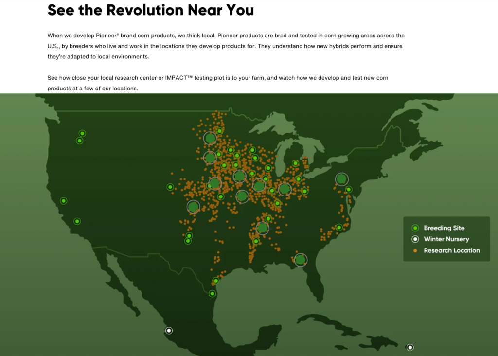
You want to know who cared about the detailed history and transition of corn seed? The more than 300,000 corn farmers—most of which are family-owned businesses.
Seed that grows under harsh conditions or improves yield can make all the difference of a farm going from one generation to the next. One of the coolest things on the page is the interactive test seed plot map. Farmers all over the country are seeing what seed varieties are doing in their part of the country.
NOTE: I understand the element could use some cleaning and design help, but the tool itself is literally something family farmers use to make 6-figure buying decisions.
Why the page works:
- It emphasizes providing data-backed proof to support the claims in its headline.
- It has a section that takes potential buyers through the process they take to ensure that they provide the best seeds.
- It leverages the company’s long history in the industry to complement data with trust.
Suggested improvement(s):
- There aren’t any calls to action that could help the buyer to get more content or sign up for a newsletter that would help them in the next steps to buy the product.
4. Omaze
Page URL: https://www.omaze.com
Omaze is an organization that creates some extremely exciting prize giveaways to promote and raise funds for various charities. They do a big push on social media through paid ads and influencer partnerships to get the ball rolling and drive excitement to the sweepstakes.
By doing all of this promotion, they can funnel huge amounts of traffic into their landing pages.
Favorite line or element: “What you’ll get”
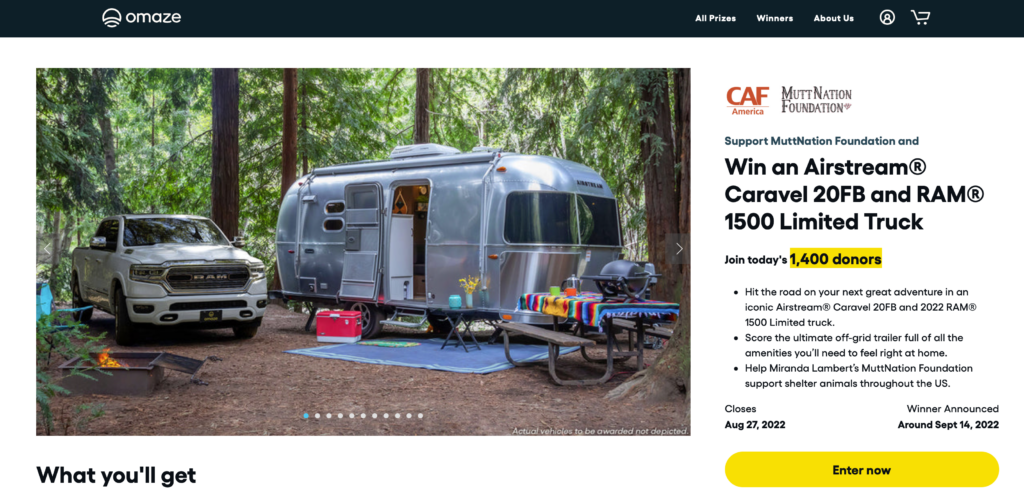
The reason this page is good may make you feel bad. In copy, sales, marketing, and life it’s all about knowing “what’s in it for me.”
This psychological truth shows in the order of any of the contest pages on Omaze.
Each contest has a dynamite headline + image followed immediately by the headline “What you’ll get.” Then, they finally tell you about the cause donors support. Like I said, it’s not necessarily ideal, but what’s right isn’t always what’s true.
Why the page works:
- These pages are optimized consistently. If you analyze their landing pages over a few months, you’ll see that they consistently run experiments so they can see what strategies work best.
- The prizes look awesome. They’ll typically have a vehicle+cash setup for their prizes. And the promo content they create for them really helps deliver the coolness factor of these prizes.
- They help you feel good about yourself. They consistently repeat the message that “by helping out, you can get a reward.” This consistency across their content really helps the landing page feel cohesive.
Suggested improvement(s):
- The prizes might look too awesome. There’s a lot of eye candy when it comes to the visual aspect, so much that it actually detracts from the foundations that they are trying to benefit.
5. Hubspot
Page URL: https://www.hubspot.com
Hubspot is one of the biggest all-in-one marketing platforms. And for a good reason. It seamlessly integrates various tools such as email, content planning, social media, CRM, and much more.
The startup that was launched in 2006 is now a $ 1 billion publicly traded company with over 100,000 users worldwide.
As you would expect, Hubspot’s landing page is highly optimized for who its potential customers are and where they are in their buying journey.
Hubspot is a complex product. However, they manage to compartmentalize all their key features so that a visitor can find what they want quickly.
Favorite line or element:
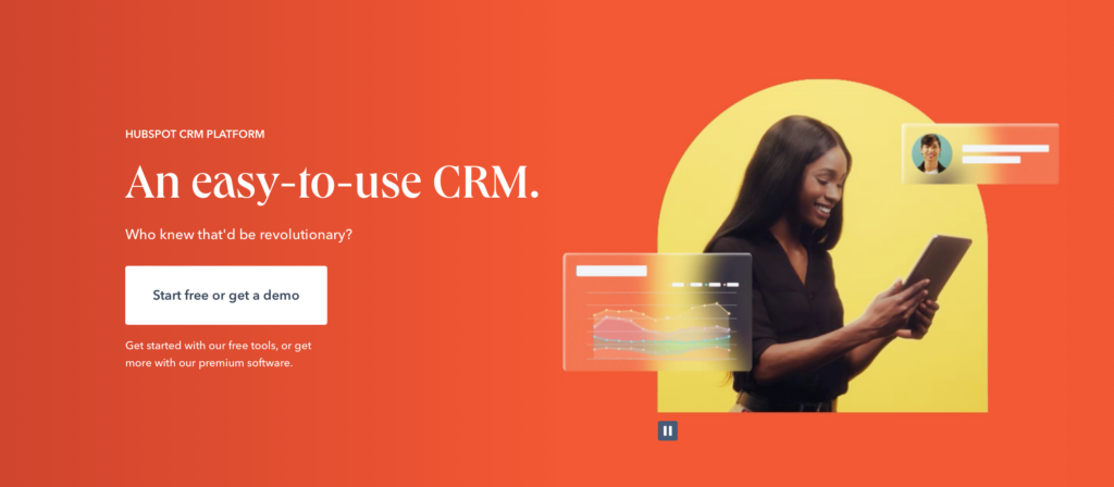
Ok, not sure if this is a positive or a negative, but it obviously works. The first heading on the page is “An easy-to-use CRM.” The term “easy” being relative, it’s likely easier than some other CRMs.
That said, take a look at all HubSpot does, their intense training, and the number of 3rd party consultants and “easy” is a stretch. But effective? No question.
Why the page works:
- Hubspot has many features and pricing levels for its products. So the landing page makes it easy for new visitors to find what is relevant to them.
- It is effortless to get one-on-one assistance from their sales team. There are many different ways for you to engage with them so that you can start on their preferred onboarding process.
- Most people who are considering using Hubspot already know about them. They’re an established player in the field, so they use this to their advantage by highlighting all the success that their users have with their products.
Suggested improvement(s):
- Honestly, not much in the way of improvements. Hubspot has some of the best inbound marketers on its team. You can be sure that just about everything on this landing page has been tested and optimized extensively.
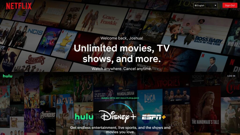
6. Netflix
Page URL: https://www.netflix.com
Unless you’ve been living under a rock for the past ten years, you probably know what Netflix is.
Netflix is synonymous with streaming video content so much that most people actually use the word Netflix as a verb. They know and understand where they stand in the streaming market, so their landing page clearly reflects this.
Netflix’s landing page is centered around making it easy for visitors to sign up and create their membership.
That’s why they don’t waste any above-the-fold real estate explaining what Netflix is. Instead, it’s all centered around getting up and running as quickly and seamlessly as possible.
Favorite line or element:
Simplicity is more than an element, it’s so great that once you find it, others will imitate your style. Netflix, despite their recent trouble and what you think about them, they know good design when they see it.
Don’t believe it?
Just take a look at Hulu, Discovery+, PeacockTV, and more and see a nearly identical copy of what Netflix started. (If you look at the comparison below, you can’t see where one ends and the other begins.)
Why the page works:
- It’s highly efficient in achieving its objective. This landing page has no fluff or unnecessary content. It knows that the vast majority of its visitors have already made up their minds about signing up, so it makes it easy to reach this objective.
- They also know through their extensive user research that one of the main questions that customers have is their pricing. To address this, they dedicate a big portion of their landing page to addressing pricing and other top visitor FAQs.
- Their headline and subhead copy is concise. It tells you what they are and addresses the main objection by letting you know that “you can cancel anytime.”
Suggested improvement(s):
- Netflix has grown into a content production behemoth. Instead of simply hosting content as they once did, they now create their own hit series and documentaries. None of this is highlighted on the landing page.
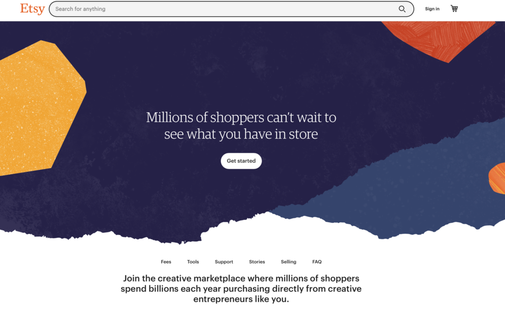
7. Etsy’s Seller Sign-up Page
Page URL: https://www.etsy.com/sell?ref=ftr
Back in the early 2000s, when eCommerce started booming, setting up an online store wasn’t easy.
First, you had to create your website, find a payment processing plugin to make it work, and then drive traffic to it. It wasn’t simple, and eBay, which was already a big player in the eCommerce space, wasn’t the best solution for every kind of small business.
Enter Etsy. Etsy made it practical for small businesses focusing on handmade goods to do a business out of their craft.
They created an all-in-one, done-for-you platform that allowed sellers to focus on their product instead of dealing with all the tech.
Today, things are different since there is a lot more competition and small vendors have a variety of ways to sell their products. Said differently, Etsy is no longer the only viable option for people considering starting a business, and Etsy recognizes this on its landing page.
Favorite line or element:
“Millions of shoppers can’t wait to see what you have in store.” It’s a great and necessary line to attract buyers. Believe it or not, more people have heard of eBay than Etsy (obvious, right?).
But with Etsy, sellers likely get higher prices for the same items and less hassle from customers.
Even still, the biggest selling point is the fact that Etsy has high traffic, because that equates to buyers.
Why the page works:
- The landing page is centered around the two main consideration points for people considering signing up: traffic and fees.
- Fees are a big deal when making a profit selling your wares. Etsy is upfront on this aspect and dedicates a significant portion of its landing page to address this aspect.
- Selling on Etsy is now a business model with which thousands of people have made a living. The landing page highlights the viability of using their platform to achieve financial success.
Suggested improvement(s):
- There isn’t much content on the actual platform from a seller’s point of view. Giving more visuals on how to transact as a seller could make it easier for new sellers to visualize how they would work with the platform.
8. Adobe’s Metaverse Page
Page URL: https://www.adobe.com/metaverse.html
Will the metaverse be how we experience reality in the future? Well, no one knows, really, but what we do know is that the metaverse is growing and just about every major brand is already there or planning to be.
This also means that there is a substantial monetary incentive to create metaverse-ready content, and Adobe is leading the way in providing creators with the necessary tools for the task.
Explaining what the metaverse is and, furthermore, explaining why Adobe provides the best tools for content creation in the space can be a complex conversation to have.
However, Adobe Metaverse’s landing page finds a way to circumvent the minutia by focusing on the opportunity of what the Metaverse promises.
Favorite line or element:
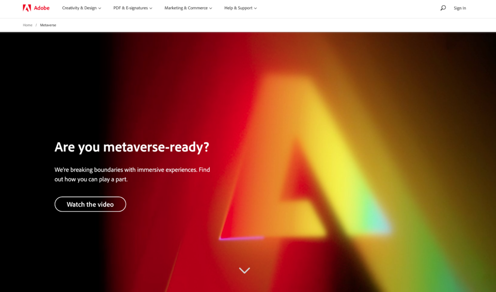
It’s an obscure favorite thing, but it’s honestly foresight. The metaverse is a place of design, art, and digitized goods. Adobe is the number one platform for creating, well, all of those things.
But as we’ve seen, when new markets arise, the current leaders often misstep and fall (Blockbuster, anyone?). Adobe is getting ahead of the Metaverse and will likely be a major backbone of the digital world currently undergoing creation.
Why the page works:
- The metaverse is still very new. However, it does a good job of explaining what it is and why you should invest in being a part of it.
- The landing page recognizes that it’s practically impossible to cover everything there is to know about the metaverse content creation process on a single page. So it provides visitors with easy access to follow-up content.
- This page is the first part of a multistep funnel. As such, it provides multiple calls to action so that the visitor can remain engaged and interested in learning more about the solution.
Suggested improvement(s):
- It’s not clear whether Adobe is providing entirely new tools for metaverse applications or if its existing tools can be repurposed. Given that, everything metaverse related is still a little hazy for the average visitor.
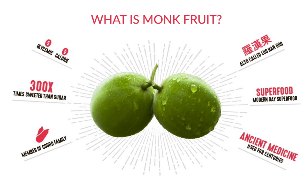
9. Lakanto’s “What is Monk Fruit?”
Page URL: https://www.lankanto.com/pages/monk-fruit
Sugar is the world’s most popular sweetener, and we can find it almost everywhere. However, there are a variety of alternative sweeteners that promise to provide a similar sweetening experience without some of the drawbacks of sugar.
One of these products is Lakanto’s Monk Fruit Sweetener.
Lakanto’s landing page does a great job at trying to convince you that its Monk Fruit alternative is not only very similar tasting to sugar but also healthier. It’s a “you can have your cake and eat it” type of value proposition that the landing page centers around.
Favorite line or element:
New markets are hard, especially when there’s really no knowledge of the fruit you use to make your products. Lakanto does a great job of communicating high levels of information quickly via infographics. Below is a single example, but it’s all over the page.
Why the page works:
- It addresses the biggest challenge that the product has, which is defining what Monk Fruit is. It’s clearly targeted at a market that isn’t familiar with its products and needs to be educated at this stage of its introduction to the market.
- The page does a great job of helping the visitor find known points of reference, such as sugar and stevia.
- They recognize who their main competition is, so the page does a good job of helping the visitor understand how it compares and contrasts with them.
Suggested improvement(s):
- There can be some confusion about what the product is because the product is not Monk Fruit, but a product that contains monk fruit.
10. Manscaped
Page URL: https://www.manscaped.com
We’ve seen several male-specific grooming products make headlines in the past years due to their innovative branding and marketing.
Dollar Shave Club was one of the first ones, but not much later, Manscaped followed them by repurposing traditional hair trimming products for the grooming needs of men.
Manscaped’s landing page relies on the premise that their trimmers work significantly better than what has been in the market because they understand the application better. And they do this in a very ingenious fashion by being very detailed about the details of male grooming.
Favorite line or element:
The favorite element is movement. It’s possibly one of the most aesthetically-pleasing websites for young-to-middle-aged men online. It looks like a bachelor pad on the page, with tons of moving elements without seeming busy.
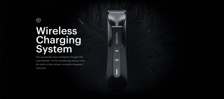
Why the page works:
- The landing page goes into detail about the intricacies of male grooming so that they can relate to their visitor better.
- It highlights the unique features and benefits of their products combined with a very attractive visual design.
- They make a great segway into the product pages by linking them all together. No need to navigate out to a product page.
Suggested improvement(s):
- In reality, this is more of a landing/product page. This merger of objectives can potentially create confusion and detract from each other’s objectives.
11. Nook Calendar
Page URL: https://www.nookcalendar.com
It’s hard to make it big in the productivity app space.
That’s because, for the most part, the native productivity apps in both Apple and Android operating systems meet the needs of most users. So it takes a unique value proposition combined with a very targeted audience to grab users’ interest and convince them to invest in a new product.
Nook’s landing page is centered around the idea that by using yet another app, you’ll be able to simplify the mess that is created by all the other apps you have to use. Even though this can be a hard sell, they make extensive use of testimonials to put their point across.
Favorite line or element:
“Own Your Time” is about as concise and perfect as you can get, when it comes to Nook’s target customer. As someone with multiple sites, income streams, and calendars—someone promising that I can own my own time has my attention.
Plus, a shout out to the dark mode look/feel. Methinks it also goes hand in hand with their buyers.
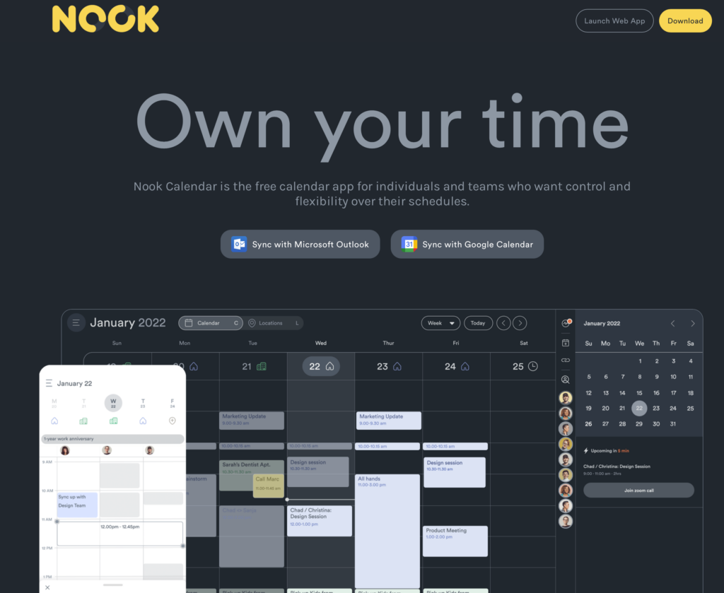
Why the page works:
- They rely on testimonials from high-visibility or power users to increase the level of trust in that they can deliver on their product’s promise.
- The landing page lets you see in great detail how the app works. This helps meet the visitor’s expectations with what is promised in the headline area.
- The calls to action are front and center so that interested users can test drive the product with a low amount of effort.
Suggested improvement(s):
- A large amount of landing page real estate is dedicated to features that are not unique and detract from the features that are.
12. Eleventy
Page URL: https://11ty.dev
According to Eleventy, building a static site doesn’t have to be complicated anymore. That’s why they’ve made one of the most highly regarded static site generators in the market. It’s simple to use but not restricted to its functionality.
Due to its combination of practicality and elegant design, hundreds of users have adopted it for their site generation needs. And Eleventy has done a great job at showcasing their user’s preferences by making it the area that draws the most attention on their landing page.
Favorite line or element:
Every commenter would say “the simple design follows up on the idea of a simple site generator.”
That’s low-hanging fruit.
The secondary communique from this page is transparency. It is soooo simple, but it also clearly gives all the documentation (important to their targets) and then gives a ton of social proof.
Super clear and effective, practically builds trust instantaneously.
P.S. Does it bother you that “Eleventy” is number 12 on the list?
Why the page works:
- It relies on its customer’s testimonials to get the message across to new visitors.
- They have one of the biggest buttons I’ve ever seen on any website ever. Kudos.
- Did we mention the big button? Seriously, it’s big, and it’s exactly what most visitors will click if they are interested in Eleventy. Kudos.
Suggested improvement(s):
- You need to click on the logo to learn more about the product’s features. This content could be brought to the main landing page as there is still plenty of space available.
13. Expensify
Page URL: https://www.expensify.com
There are hundreds of financial consumers and enterprise-level financial products in the market.
But Expensify created a niche financial product that is tailored to the needs of accountants. This is a big differentiator to traditional alternatives since it gives them a distinct functionality advantage compared to typical benefits offered by other cards.
The landing page takes a minimalistic approach by not showcasing much about the product but rather invests most of the page’s real estate in making sure that the visitor knows who the product was designed for.
Favorite line or element:
Every visitor has a subconscious question burning in the back of their brain, when they come to your site—What do you want me to do?
Sure, they think they’re there for a reason, but they want you to guide them. Expensify understands why people show up and if you look at their homepage and take more than 5 seconds, you clearly understand your next move.
You either leave or sign up for a free account.
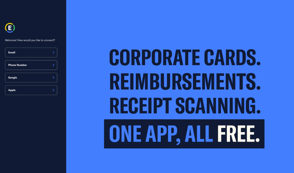
Why the page works:
- They have a clear target for whom the product was built and make sure that every visitor knows it.
- They empower the visitor by giving them a variety of choices of how they want to move forward with the next steps in the process of acquiring the product.
- The headline copy is the one and only focus of the landing page. This makes sure that the only visitors who are entirely sold on their value proposition move to the next stage of the process.
Suggested improvement(s):
- Some additional product information could be included so that visitors can have a sense of whether or not the product will fit their needs.
14. Airbnb Hosts Page
Page URL: https://www.airbnb.com/host/homes
The idea of becoming a host is what helped Airbnb take off and become the hospitality disrupting behemoth we know. That’s because becoming an AirBnb host has always made a lot of financial sense for anyone interested.
It let them monetize on an asset that was not previously monetizable, and this resonated with thousands of people all over the world.
Today, you can host a lot more than just your space on Airbnb.
You can host experiences and a variety of other services that can be both fun and profitable. The landing page relies on sharing its hosts’ experiences to convey the message that the visitor should sign-up and give it a try.
Favorite line or element:
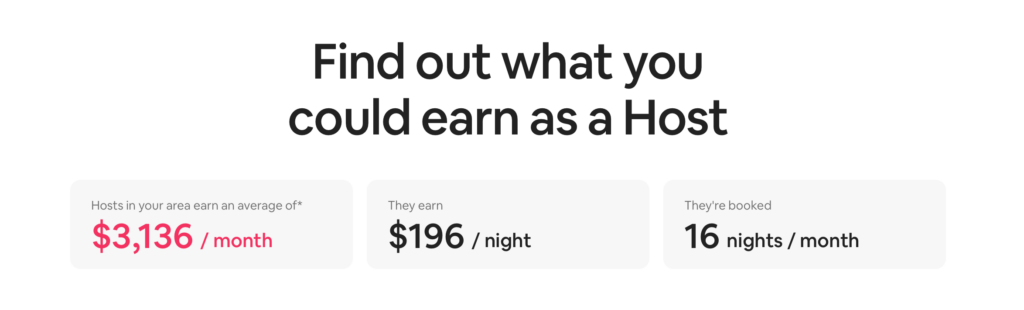
Gotta be the earnings calculator here. It’s a great way to energize potential hosts, and it’s right below the fold.
Why the page works:
- It uses reviews from real hosts that make the platform work. This provides proof of concept to anyone interested in trying it out.
- It’s easy and straightforward to sign up.
- It features an earning calculator that gives the website’s visitors realistic expectations of what it will be like working as an Airbnb host.
Suggested improvement(s):
- It doesn’t go into detail about all the nuances involved with being an Airbnb host. A little more clarity in this area could make sure that visitors that sign up have a lower attrition rate.
15. Wix
Page URL: https://www.wix.com
Wix is one of the startups that developed the idea that anyone should be able to build a website. This meant that their website builder would be both easy to use and free. The value proposition caught steam and helped them reach the 200 million user milestone by 2021.
Today, there are several free and easy-to-use website builders that users can choose from.
That’s why now the landing page has pivoted to a different value proposition. Now they choose to focus on the control over your website. This sets them apart from the competition since the other offerings in the market have limited functionality in their free versions.
Favorite line or element:
Wix’s FAQ (toward the bottom) shows they both understand and own their audience’s needs.
The questions are entry-level, when it comes to getting a site online and know they’re dealing with extreme novices.
Why the page works:
- It lets you know why it’s different and focuses on the type of user that has a clear idea of what they want to get out of their website builder of choice.
- The headline copy helps make it easy for the visitor to try out by letting them know that “no credit card is needed” for them to try it out.
- It has a process area that shows visitors the exact steps that they need to follow to reach the goal of creating a website for free.
Suggested improvement(s):
- It’s hard to point out a specific area to improve. Since Wix receives massive amounts of traffic, they have all the data they need to make sure that their landing page is consistently optimized.
16. TripIt
Page URL: https://www.tripit.com/web
As mentioned in the Nook section of this article, it’s hard to stand out in the productivity app space.
However, TripIt has managed to find a huge niche that was underserved and hungry for a purpose-built app. TripIt has evolved into a one-stop hub for frequent travelers that need to keep track of a variety of itineraries, flight restrictions, and schedule changes.
The landing page revolves around the idea that if visitors try out the app, there is a high probability that they’ll become paying customers. That is why you’ll see spread out across the landing page several areas where they emphasize that you can sign up for free.
Favorite line or element:
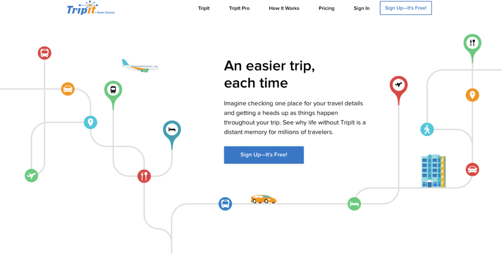
Colorful and illustrated websites are tricky, but TripIt pulls it off. As soon as the page loads, you want to head out somewhere…anywhere.
It’s a whole travel vibe and the icons, colors, and images pull it off.
Why the page works:
- The landing page focuses on features that go beyond what you would typically expect in a productivity app.
- It includes product reviews throughout the landing page to better illustrate the benefits of each of TripIts main features.
- There’s a big emphasis on the fact that it’s free to try.
Suggested improvement(s):
- It doesn’t really show you how the app looks or much about the user experience.
17. Notion
Page URL: https://notion.so
Remote work is no longer something new but has seen a huge explosion in recent years. Yes, you know why.
It’s estimated that more than 4.3 million people work remotely in the US alone. And the number continues to increase as more businesses, both small and large, embrace remote work.
Notion is a remote work productivity app that helps organizations avoid the problems that come with remote work, such as miscommunication and lack of context within work teams.
Notion’s landing page goes into detail about how each one of these problems impacts teams and makes them enjoy life a lot less. And let them know that these problems are solved by using the app.
Favorite line or element:
Notion is like a jar of Playdoh. All you need is imagination and a couple of tutorials and you can organize your job, business, and/or life with this one tool.
Classically, when a tool does a lot or leaves too much to the imagination, it’s hard to sell and explain. It’s for this reason I like that they embrace taming chaos and have a quick, easy-to-understand gif tutorial right on the homepage.
Why the page works:
- It will make visitors nod in agreement as they read along with the highly detailed descriptions of the problems they likely have to deal with daily.
- The landing page features several areas where they can sign up for a free trial. This makes moving forward in the customer journey simple.
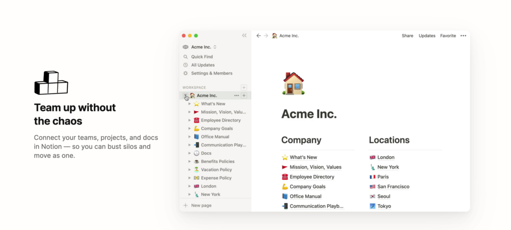
- They feature plenty of images of the user interface. This gives visitors a good idea of how it is to use the tool on a day-to-day basis.
Suggested improvement(s):
- It’s hard to find out more details about some of the main features. It’s a complex product that requires a high level of commitment before serious consideration.
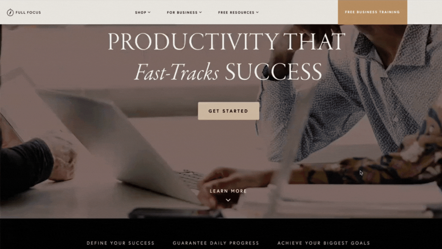
18. FullFocus
Page URL: https://www.fullfocus.co
You can think of Full Focus as the Hubspot of productivity coaching. It’s an all-in-one productivity platform for individuals and organizations that have ambitious goals and need to be able to pour all of their focus on reaching said goals.
The premise of the landing page is that by using their services, you’ll be able to unleash all of your untapped productivity and fast track your way to success.
The concept of success is what the landing page approaches from several different angles to make sure that its visitors can relate to the definition of success that resonates the most with them.
Favorite line or element:
Famed leadership expert, Michael Hyatt, rebranded to “FullFocus.”
His new site is clean, as you’d expect, but my favorite part is it’s a low-key sales page. The company lists half a dozen products, courses, and resources in a way that’s not offensive.
Bravo.
Why the page works:
- Success can be a somewhat vague or ambiguous concept. However they are successful at tying it together with other concepts that are more specific.
- It clearly states who their customers are: business owners, CEOs, and people in leadership positions.
- It has video testimonials that showcase its actual customers. This is a step beyond the typical two sentence testimonial we often find.
Suggested improvement(s):
- Full Focus has a wide range of products that go from planners to virtual assistants to one-on-one coaching. This can confuse the visitor since it’s not clear what their main offering is.
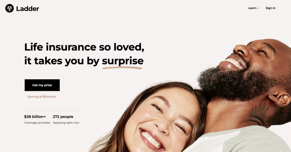
19. Ladder Life
Page URL: https://www.ladderlife.com
The insurance industry is seeing disruption from a variety of well funded startups that aim to be more efficient and pass on the savings to their customers.
The life insurance industry is huge. It’s over $922 Billion and growing, so even if they take control of a small percentage of the industry, they can still be massively profitable.
The landing page is focused on positioning itself as a more affordable and DIY insurance option compared to the traditional offerings from legacy institutions. Since pricing is the main factor that will impact the visitor’s decision making process, they make sure to give you access to a tool that will give you your price from the get-go.
Favorite line or element:
Ever hear a radio insurance commercial?
There’s more legal jargon rattled off than actual ads.
And that’s why I was shocked to see so few words on the homepage of LadderLife. Each one is meaningful, but there aren’t that many—impressive.
Why the page works:
- It’s friendly and helps you get the information you care about the most right on the headline area.
- It sets clear expectations regarding what type of outcome you can expect and how much time you need to invest in getting it.
- It goes into detail about how the process of getting your quote works. This way, visitors know exactly what they are getting themselves into when they click on the call to action buttons.
Suggested improvement(s):
- Ladder Life has a new and innovative model to approach how life insurance is traditionally offered. They don’t address why their visitor should prefer them over what’s already on the market other than for the convenience of being able to do it online.
20. Kinsta
Page URL: https://www.kinsta.com
With over 455 million websites built with WordPress, there has been an entire industry of apps and services designed to cater to the needs of its users.
Kinsta is a specialty hosting service for businesses that rely on WordPress to run their business.
To give additional context, WordPress isn’t the first option for businesses that are scaling their traffic. Most experts tend to migrate to build their new websites on different platforms. However, Kinsta makes scaling much more feasible, reliable, and cost-effective.
Favorite line or element:
“Save hours of work and hundreds of dollars every month”
Kinsta’s not the cheapest host, but understands their target site owners are those who have traffic and make money online. So while they charge more than the HostGator’s of the world, they end up saving you time and money in the long run.
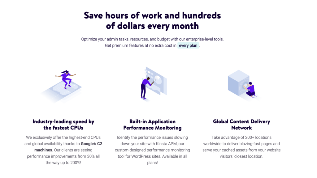
Why the page works:
- The headline lets you know that there are over 24,000 businesses that use Kinsta. This not only means that they are reliable but also that you can find a growing community of Kinsta users.
- Speed is one of WordPress’s biggest problems, so Kinsta addresses this problem directly by providing a large amount of technical data on how they manage to improve speed.
- They offer specialist support. This gives interested users peace of mind since they know that they can rely on the expertise of the support team.
Suggested improvement(s):
- A more focused approach is needed. The landing page is massive as it does double duty as a product and pricing page.
21. Guided Discoveries
Page URL: https://www.guideddiscoveries.org
The summer camp industry in the US reached the $3.91 Billion mark in 2021 and continues to grow.
There’s a good reason for this.
For starters, parents are always interested in finding ways in which they can immerse their kids in a positive environment when school is out. Also, securing reliable child care has become increasingly more expensive, and parents still need it.
Guided Discoveries is a summer camp with a twist.
It not only has outdoor activities but also merges them with STEM-based activities. This helps give kids a multifaceted experience where they have fun and also learn valuable skills.
Favorite line or element:
There were a couple of years that kids didn’t see other kids, and even before that “adventure” isn’t really closely associated with childhood anymore.
Guided Discoveries takes that pain of wanting your kids to have adventures and make true bonds with people their age—turning it into a nonprofit.
Their homepage gets parents more excited than the kids with power words like “connection” and “education through exploration.” Why?
At the end of the day, parents make the decisions, so it makes them the ideal customer.
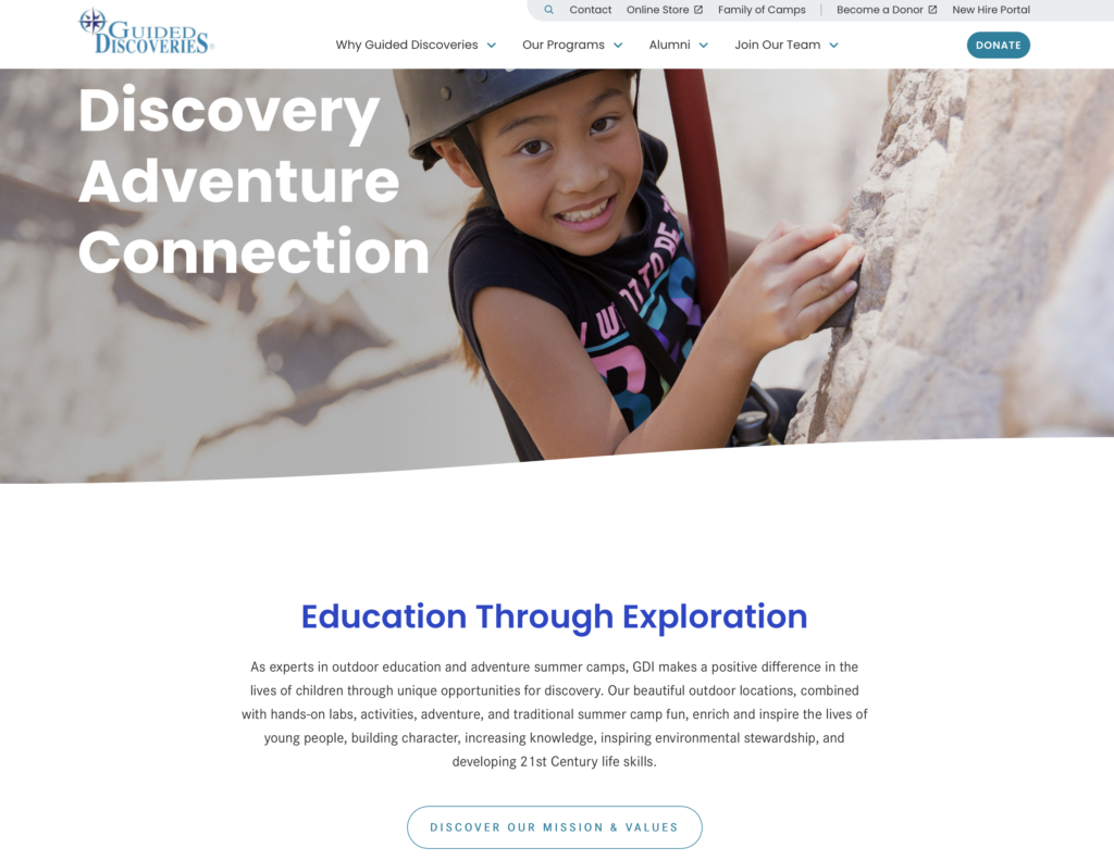
Why the page works:
- The landing page does a great job of showing what the camps look like and what type of activities the kids will be involved in. The images are great, and the descriptions are comprehensive.
- Guided Discoveries is also an educational institution with school programs. They use this fact to supplement their educational focus during the summer camp season.
- They make a big emphasis on their values and what they believe in. This way, it’s easy for the parents who visit the page to understand what Guided Discoveries is about and if their values are compatible.
Suggested improvement(s):
- The headline is somewhat of a missed opportunity. It doesn’t describe much about what Guided Discoveries does.
22. Muzzle App
Page URL: https://www.muzzleapp.com
If you’ve found yourself increasingly spending more time in Zoom calls, haven’t you noticed that you always seem to get some notification the exact moment you’re sharing your screen?
Well, you’re not alone. It’s annoying and distracts from what you’re trying to share on-screen.
This is why the Muzzle App was created. It makes it easy for you to turn off notifications on Mac OS so you can feel confident that you won’t get interrupted during your screen shares.
The landing page is as straightforward as the functionality of the app. Turn the app on, and the notifications go away.
Favorite line or element:
Sit on the homepage of Muzzle for more than 5 seconds and you’ll instantly have the “aha!” moment intended.
Notifications suck. Big time.
Then, read their name again, and you’re either sold or love being needed all the time.
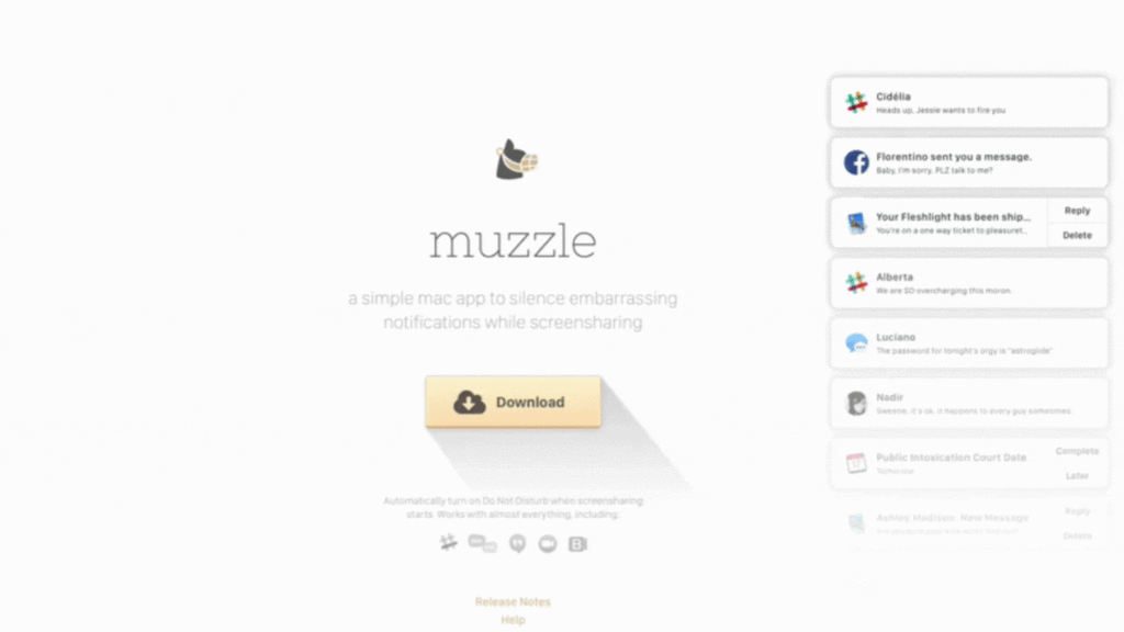
Why the page works:
- The landing page uses comedy as a way to grab your attention. This is refreshing and inspires a chuckle, which is a good thing since most landing pages are, for the most part, dull.
- It’s a simple landing page with few elements. However, they all tie up to support the main theme.
- The download button is front and center. There is no need to navigate through a complicated signup process.
Suggested improvement(s):
- The app is simple, but there’s no real explanation of how it works or what it looks like on the landing page.
23. Animalz
Page URL: https://www.animalz.co
Content marketing is a very powerful marketing strategy that brings consistent long-term results for businesses across just about every industry.
People who claim that no one ever reads anymore are mostly wrong, and there is plenty of data to support the fact that most people still read and use content to decide whether or not they want to work with your business.
Animalz is a marketing agency that specializes in content marketing, and their landing page states this upfront.
It’s focused and doesn’t try to sell itself as a “do everything” agency. They are great at creating engaging content and let you know right off the get-go what they focus on.
Favorite line or element:
Sometimes it’s so easy to tell your visitors what you want them to do.
In the case of Animalz, they literally draw a line that takes you from seeing what they do, who they’ve helped (huge brands), and the next step they want you to take.
Simple, easy, nearly perfect.
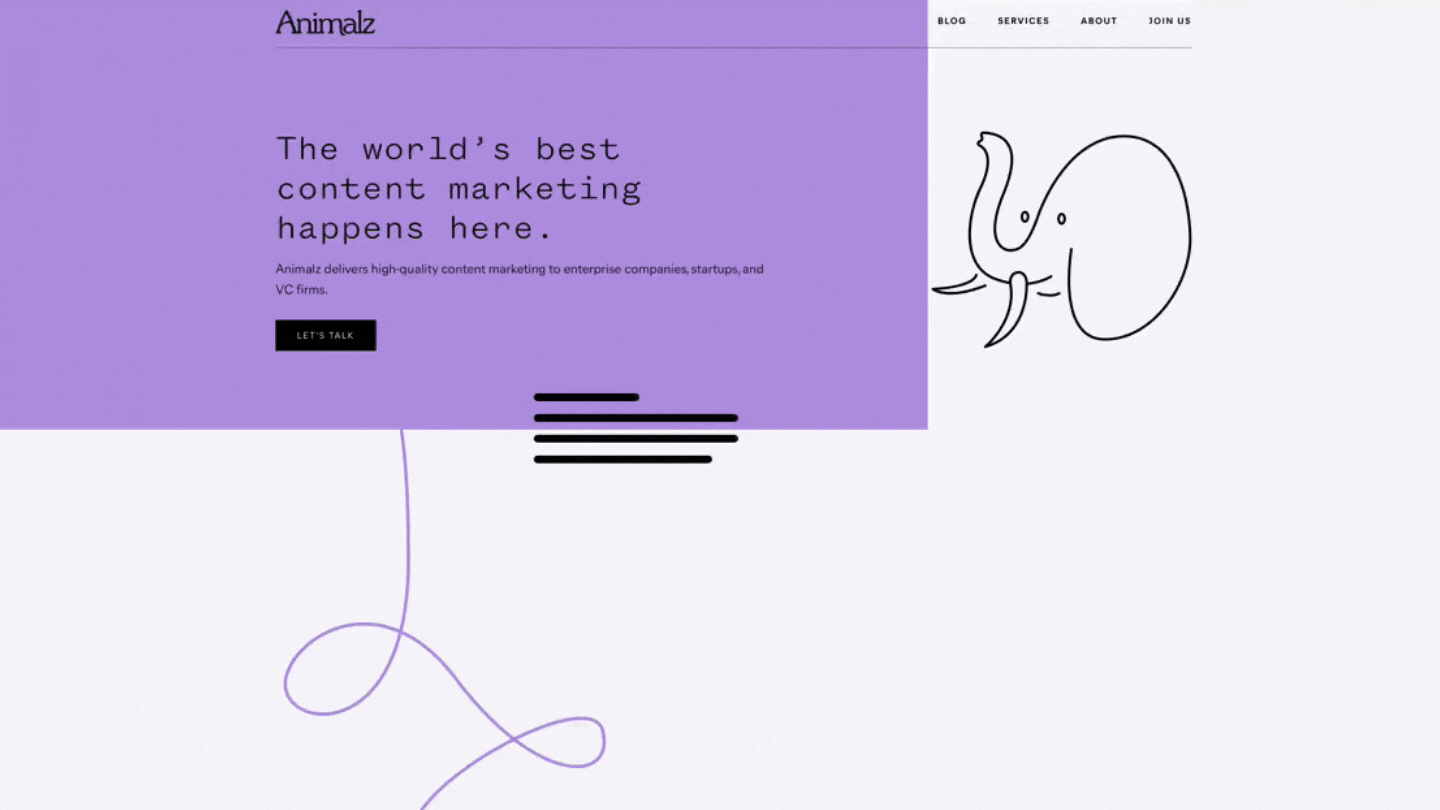
Why the page works:
- Simplicity and focus are the main objectives of the landing page. They do content marketing, and that’s all you get on the headline.
- They highlight their big-name clients.
- They don’t try to convince you that they do anything else other than content marketing.
Suggested improvement(s):
- The landing page doesn’t provide much data about results or any other success metric.
24. White Oak Pastures
Page URL: https://www.whiteoakpastures.com
White Oak Pastures is a farm located in Georgia that has embraced sustainable practices such as regenerative land management and humane animal husbandry to minimize their environmental impact and provide the highest quality products to their customers.
Their landing page does a great job of explaining how they run their farm and why it’s important for them. In other words, they share their values and beliefs on how they run their farm and how this translates to high-quality products for their customers.
Favorite line or element:
Meat is progressively getting a worse and worse rap. Factoring farming is gross, but there is a better way. White Oak lives by regenerative farming that improves and sustains soil and the biology of the area.
By their site, you’d honestly think they’re an environmental brand, which draws those people who know they’re not vegan, but still want to feel good about what they eat.
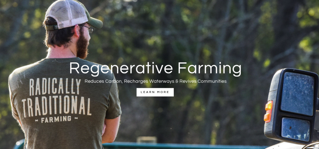
Why the page works:
- The page is all about sharing their vision on how animal products should be produced. Their graphic design and copy are working together to educate and convey the importance of their values.
- It does a great job at showing its three main products and services.
- They have great video content showcasing how they manage their farm and how it’s consistent with their sustainability claims.
Suggested improvement(s):
- The landing page mixes in their products and services, so there are several calls to action scattered across the page. A more focused approach could be a great alternative since they have great content about what they do.
25. My Golf Spy
Page URL: https://www.mygolfspy.com
People love product review websites. They help you save time and, in some cases, can even be entertaining.
However, for a review website to work, they need to prove that they are experts in their niche and provide unbiased information.
MyGolfSpy is a golf product review site. Unlike other run-of-the-mill golf review websites, they go the extra mile and have hands-on experience with the products they review.
Their landing page is full of insightful content that gives their readers all the necessary context to make an informed buying decision.
Favorite line or element:
[Movie trailer voice] In a world of overly-optimized review content, written by people who’ve never used the products, My Golf Spy stands out above the rest.
Why? They actually use the stuff they review—a novel concept.
Genuine content is (by far) my favorite element here, but it’s not easy to come by. Just take a look at the investment involved by the screenshot (or any review on their site).
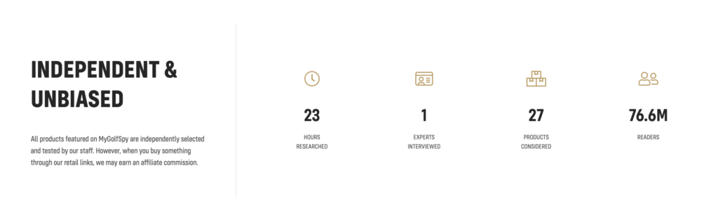
Why the page works:
- It’s useful and provides in-depth information about the products they review.
- They clearly demonstrate that they know golf and what golfers look for in their gear.
- They link out to the products they review so you can find them easily.
Suggested improvement(s):
- They have ads, lots of them and they are scattered everywhere, which is detrimental to the user experience.
26. DopeCFO
Page URL: https://www.dopecfo.com
The cannabis industry, although still young, has continued to grow at an astonishing pace.
Cannabis sales increased to $25 Billion in 2021, a 40% increase from 2020. All this money going into the industry means that there is an increased need for accounting professionals that can help businesses manage their books and keep them compliant with regulations.
DopeCFO is a network of financial professionals that specialize in the cannabis industry.
Think of it as the LinkedIn of cannabis accountants. Their landing page demonstrates that they understand what the most pressing issues for the industry are and that they know how to navigate the changes to the legislation.
Favorite line or element:
In a word, my favorite part is “contrast.”
Obviously, a name like “Dope CFO” is a hilarious way to brand yourself as an accounting firm specializing in cannabis/CBD.
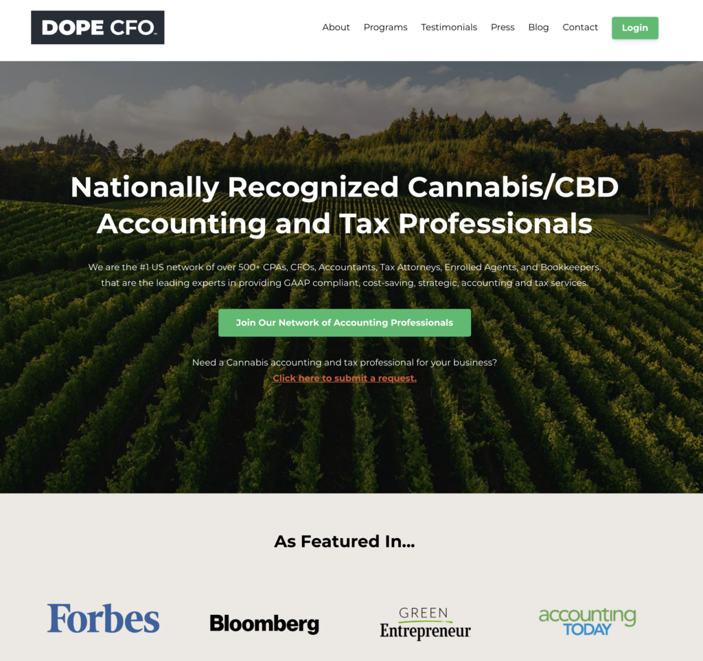
But go on the site and it’s all business. You see tons of proof like “nationally recognized” and big features like Forbes and others.
You see the name, you giggle. You see the credentials and it’s no joke. That’s contrast used well.
Why the page works:
- The headline area clearly tells visitors what kind of help they can find on the website.
- The landing page has several sections which cover important topics that their visitors are looking to manage.
- All the content on the page makes it easy to understand that they have true industry expertise.
Suggested improvement(s):
- The landing page is intended for accountants, but the calls to action are somewhat vague as to what you are signing up for.
27. ClickUp University
Page URL: https://www.university.clickup.com
ClickUp is a combination of a CRM and a project management tool that was designed to meet the specific needs of marketing agencies.
As such, it has seen extensive use in the marketing industry because how it structures its workflows makes a lot more sense than using other tools available in the market.
ClickUp University is dedicated to helping its users get the most out of ClickUp by providing them with additional resources that can complement their project management skills as well as more in-depth functionality.
Favorite line or element:
This is open-sourced product education. How many times have you wanted to see the nuts and bolts of a software, but had to head to some random person on YouTube?
Too often.
ClickUp opens up their product tutorials for all to see in a well-produced “University.” It’s a sales tool for those who seriously consider their product.
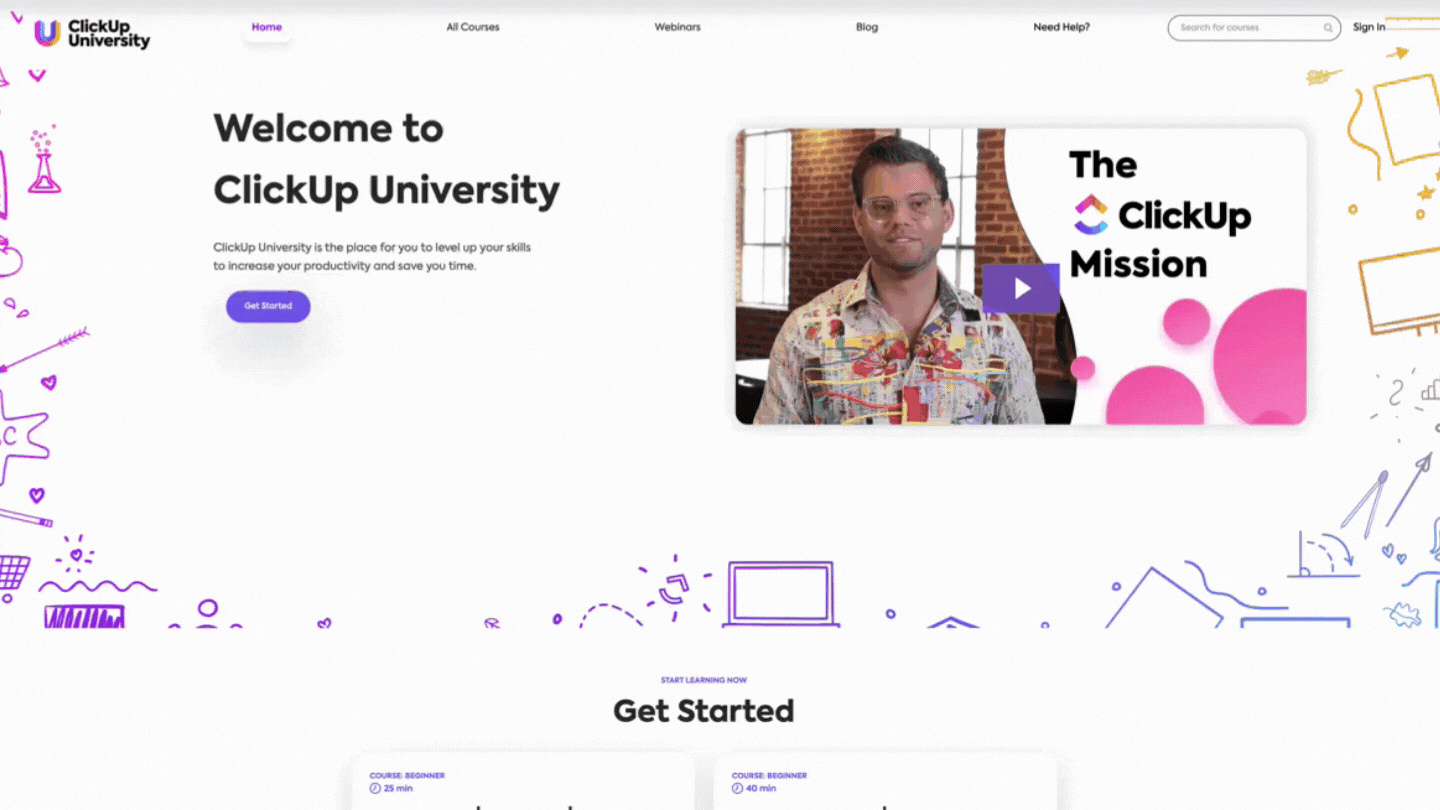
Why the page works:
- It’s designed to get you started on their learning paths, and it’s easy to do so because the button to take you there is featured above the fold.
- The course names are descriptive and give you a good idea of what you will get when going through that course.
- It’s easy to navigate over to the content that you are looking for from the landing page.
Suggested improvement(s):
- They could include more information about how the courses are structured so that visitors can understand the outcome of going through them.
28. SEMRush Stories
Page URL: https://www.semrush.com
SEMRush is one of the biggest brands in SEO.
It has a whole suite of tools that let SEO marketers diagnose, evaluate results, and design strategies that will increase traffic. SEMRush stories is a resource created for users that want to see what has worked for other brands in their specific industry or niche.
The landing page serves the purpose of showcasing the results that are achievable with SEMRush and as a highly effective way of obtaining more long-form customer testimonials.
Favorite line or element:
Sometimes, you need a lot of information on the page and it’s for a few different types of buyers. Such is the case of SEMRush.
They have individual site owners and agencies who help lots of site owners. Both of those customers come from many industries and in all shapes and sizes.
But how can you clearly communicate? Well, their “Stories” page is a good example of organizing case studies in a way that helps visitors find the closest use case to theirs.
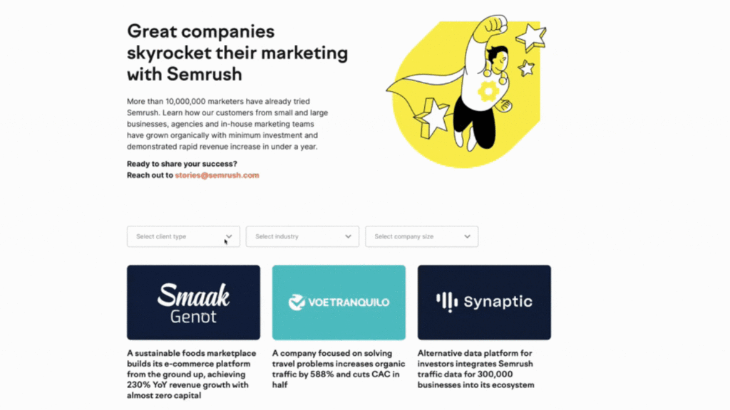
Why the page works:
- It’s a genuinely useful resource. It doesn’t just show what can be achieved but also how.
- The search engine function makes navigating through all the content easily.
- It encourages users to share their stories with the SEMRush team. This in turn builds a long-term relationship with their users and creates an active community.
Suggested improvement(s):
- There’s not much to suggest unless user data is available. SEMRush has a big team, and they invest a lot of their resources into optimizing their landing pages.
29. Spotify for Artists
Page URL: https://artist.spotify.com
Spotify is the largest streaming service in the world with about 30% of the whole music streaming market share. This means that there are millions of people listening to just about any musical genre you can think of.
And if you are an artist, then you can be certain that you’ll be able to find an audience for your music within Spotify.
The problem is, how do you do this? And this is exactly the question that the Spotify for Artists landing page aims to answer.
The landing page goes through the artist’s thought process. It answers the questions: How does this work? Is it possible? How can I start?
Favorite line or element:
You’d think Spotify would be luring artists with “get famous” or “billions of ears.”
But no. They use data.
The backend of Spotify, for artists, has features tailored for uploaders just like downloaders. A singer or podcaster can get analytical data about listens to learn more about their fans.
That’s a big draw for great artists who want to improve, which…only serves to help Spotify draw even more ears.
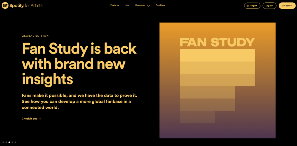
Why the page works:
- The page clearly explains what success looks like for an independent artist that decides to invest their energy into the Spotify music ecosystem.
- It showcases all the tools that are available for artists and how they can leverage them to reach more listeners.
- It has a section on case studies and how to guides that go into detail on what are the steps that a new artist on spotify needs to follow to reach their listeners.
Suggested improvement(s):
- It has a large number of different calls to action which may have its visitors going from one place to another trying to find what they’re looking for.
30. Robinhood
Page URL: https://robinhood.com
Robinhood is one of a handful of companies that are trying to make investing, whether in stock, crypto, or commodities, mainstream.
And for investing to become mainstream, they had to find a way to lower the entry barrier and educate their users that investing is for everyone. Robinhood has done this by creating an app so that you can do everything on your phone and by making it easy to start with small amounts of capital.
The landing page is clearly aimed at the younger generation that is more open minded about how to invest their money. Because of this, a lot of emphasis is made on the fact that using Robinhood and becoming a successful investor can be easy.
Favorite line or element:
Robinhood’s been in and out of the good graces of their target users, but the messaging is still on point.
They want to help people, who don’t have a lot of money, get into the investment game. All over the site, you see plugs for investing as little as a buck, crypto, and getting free stocks.
It’s not surprising a company worth billions understands their ideal client. But it’s still worth a look for ideas.
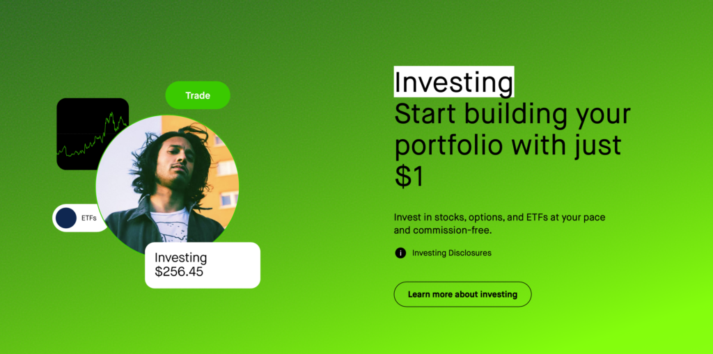
Why the page works:
- Their headline clearly states what Robinhood believes in. Investing is simple.
- The landing page addresses one of the main objections that most first-time investors have, which is how much capital they need to get started.
- They have a large section dedicated to educating their visitors. This way, they can meet them wherever they are in the process of becoming an investor and stay with them until they are ready to become a user.
Suggested improvement(s):
- Robinhood has various products, and they are all glanced over on the landing page. This causes it to spread its focus from educating first-time investors on what they need to know to make the decision to sign up.