
High-converting landing pages have one thing in common:
They match user intent and present a compelling offer.
When users explore high-converting landing pages, they see their problems described in a way that resonates with them and handles their objects.
Then, they’re presented with a perfect-fit offer that they’re able to easily take action on.
In short:
Landing pages that match user intent, identify pain points, present a solution, and deliver a compelling offer are likely to be successful.
But there’s plenty more you can do to optimize your landing page even further, from strategy and design to copy and optimization.
Let’s start with a couple of examples.
First, here’s what not to do.
A search for “b2b consulting” on Google brings up the following ad for Imparta.com, a sales training service provider. Unfortunately, the landing page is a case study in everything not to do:
- It’s essentially a wall of text
- There’s no benefit presented
- It’s filled with jargon and a bland stock photo
- There’s no clear call to action other than “contact us”
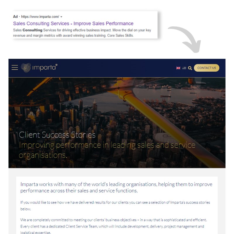
Anyone landing on this page would have a hard time taking action—even if they wanted to!
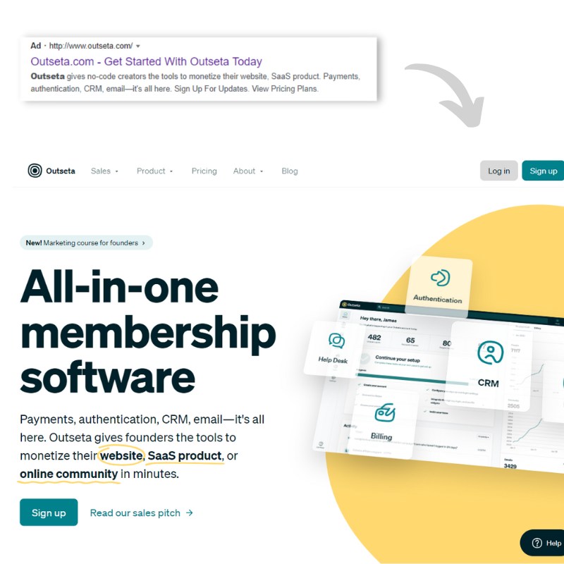
Contrast that with Outseta, a SaaS that powers online communities and memberships.
A Google search for their name results in an ad that assumes you already know about Outseta (because you searched for their brand). The ad drives you straight to Outseta’s homepage, which features:
- Easy-to-read text
- A clear call to action
- Custom images that tell the story of the product
- A compelling benefit (“monetize your website, Saas product, or online community in minutes”)
Imparta’s landing page puts no effort towards converting the user.
Outseta’s landing page carefully considers the audience’s needs and presents a high-converting design with optimized copy and a clear call action (CTA).
In the rest of this article, we’ll explore everything you need to know to create a high-converting landing page.
Start By Understanding Your Audience
If you don’t already have an intimate understanding of your audience—that’s step one. You’ll want to understand their desires and pain points before writing your landing page copy.
Depending on your product and goals, this could be as simple as exploring Reddit or Quora to see what your target audience is frustrated with, and consider how your offer solves those problems. If you have a direct line of access to your customers—such as interviews or surveys—asking them directly is even better.
When writing your landing page copy, focus on your visitor’s problems and how you can solve them painlessly. Avoid talking about what you do. Service-focused statements like “We provide marketing services” are less powerful than “We help SaaS founders increase sales by 55%+ with high-converting copywriting.”
Know where your visitors are in the buyer’s journey
If the traffic arriving to your landing page has high commercial intent, you may be able to go straight for the sale. This is the case for some landing pages that get highly-targeted traffic from ad campaigns.
But most visitors aren’t ready to buy yet. Each person on your page is somewhere in the buyer’s journey: Awareness, Consideration, and Decision.
Use the buyer’s journey to inform your landing page’s offer. Know where your audience is likely to be, and construct your offer around that.
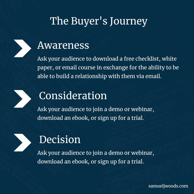
Buying is an emotional decision. It’s rooted in instinct and trust. For visitors in the Awareness stage, your best bet is to present them with low-friction CTAs like watching a video or signing up for your email list. This gives you a chance to educate and nurture the relationship over time.
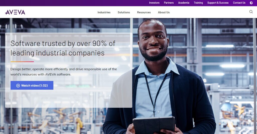
Aveva provides enterprise software for industrial companies. Anyone reaching the landing page below likely has a long sales cycle ahead of them, given that decision-making within large companies can be complex and lengthy. Aveva sticks with a simple “Watch video” educational call to action.
If your audience is in the Consideration phase, you may be asking them to join a demo or webinar, download an ebook, or sign up for a free trial.
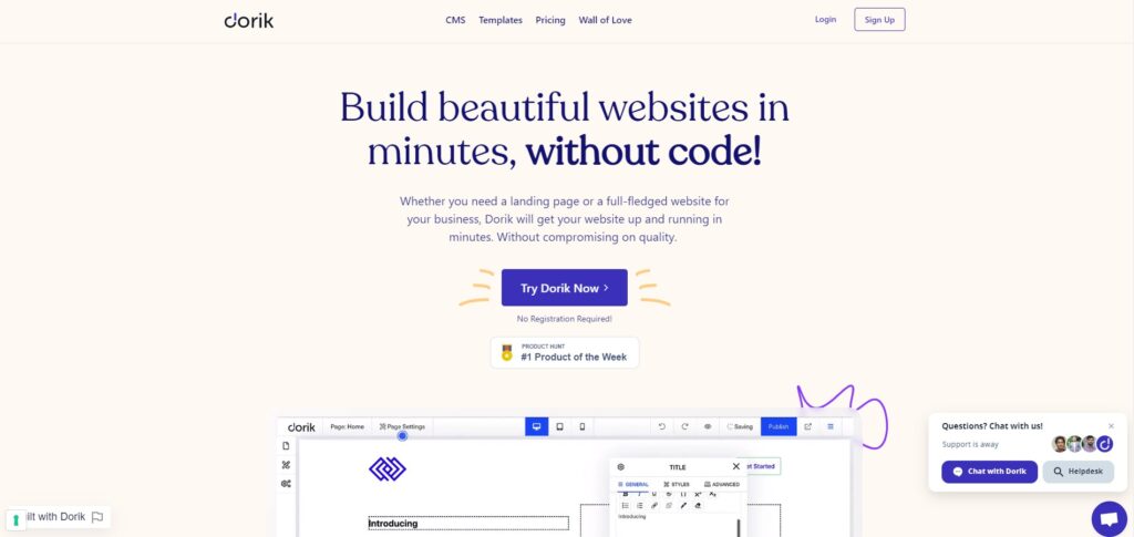
The no-code website builder Dorik, like many software companies, falls into this category. They offer free trials on their landing page.
If your audience is in the Decision stage, it’s time to nudge them towards a consultation, quote, or purchase.
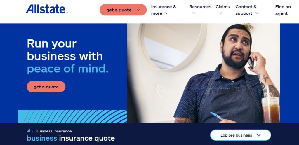
By the time visitors have reached Allstate’s Business Insurance page, they’re primed for a direct offer for a quote on business insurance.
How to Optimize a Landing Page
Optimizing a landing page touches nearly every aspect of marketing, including design, copywriting, psychology, and A/B testing.
Design and Layout
Bad landing page design causes users to leave before they even have a chance to understand your offer. 90% of people have left a website because it was badly designed, and 93% of people have left a website because it didn’t load quickly enough.
Good design is critical for first impressions, for ensuring your visitors don’t bounce, and for giving your landing page copy a chance to work its magic.
Landing page design starts with the critical “above the fold” real estate—the area of the website that users see without having to scroll down. Most readers see your headline, the first few words of your subheader, your call to action—and not much else. Be economical with how you use the above the fold real estate, and recognize that the headline, subheader, and CTA are the most important parts of your landing page.
Many landing pages are designed around the F-shaped reading pattern first uncovered by UX firm Nielsen Norman Group in 2006. Using heat maps, researchers found that users tend to read horizontally starting in the upper left side of the content area. Then, users move their eyes down the page a bit and scan horizontally again—a bit less far this time. Finally, users’ eyes scan the rest of the content in a vertical movement.
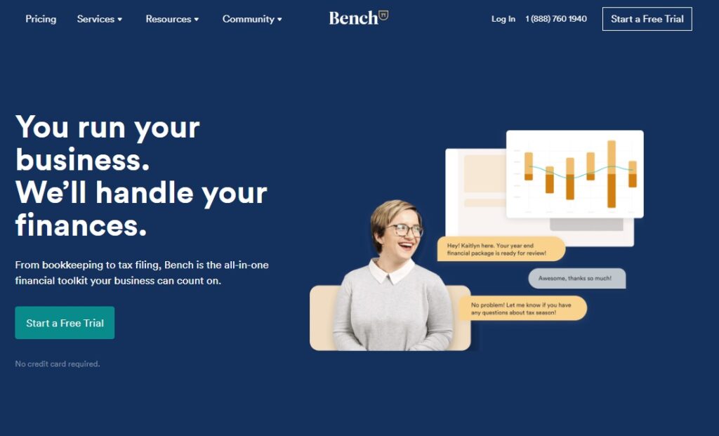
Financial services company Bench, below, shows a classic example of a design optimized for the F-shaped reading pattern.
Since users have so little attention to spare, the best landing page designs remove distractions that are unrelated to the goal of conversion. When creating custom landing pages for ads, remove distractions like navigation bars, sidebars, and footer links. By removing distractions, you’re giving yourself a chance to increase conversions up to 30-40%.
Embedding videos may also fall into the “distractions” category unless you have a highly-relevant video that primes users to convert. In a review of 35,000 landing pages, Unbounce found video had a neutral or slightly negative impact on conversion rates.
Copy
Here’s a depressing statistic: A UX firm found that users read at most 28% of the words on your page. One survey reports that 75% of users skim long-form content rather than read it thoroughly.
That’s why it’s so critical to choose your landing page copy carefully.
Use your headline to talk about benefits to the reader (rather than product features).
Write a subheader to elaborate on the claims in your headline, provide context, and differentiate your product or service from competitors.
Include social proof prominently on your landing page. Social proof like testimonials and logos can increase conversion rates by nearly 10%, according to an Unbounce study.
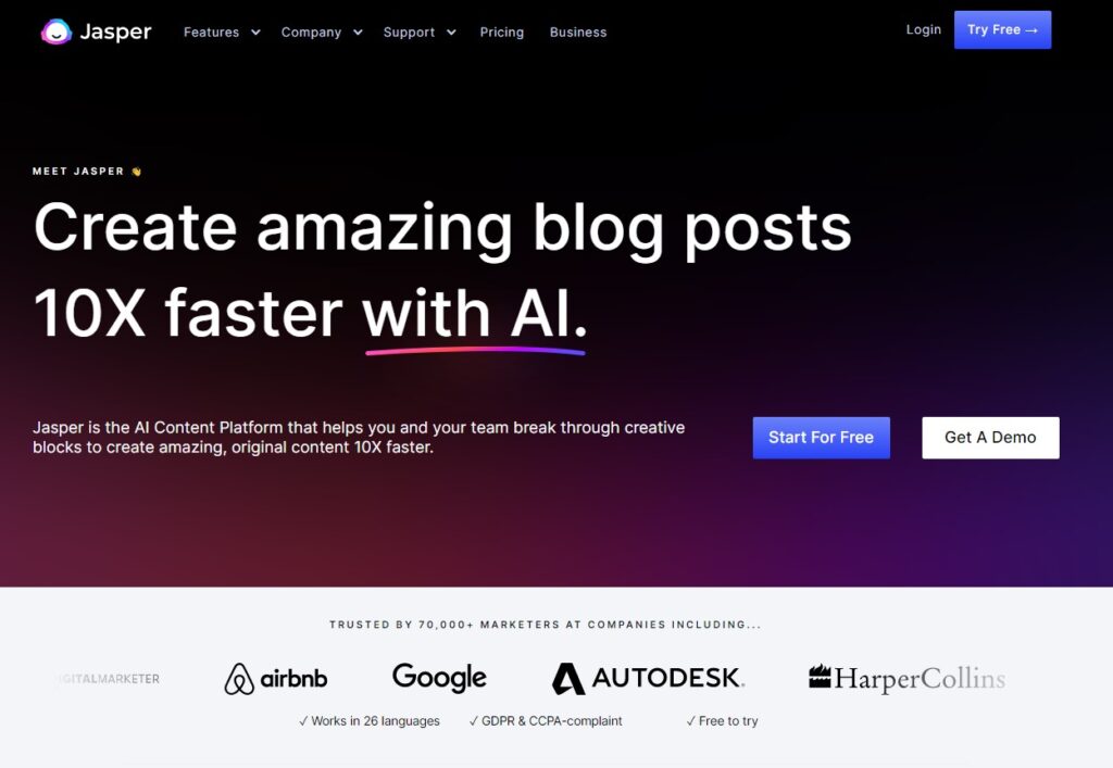
Jasper’s homepage header makes the benefits clear (“write blog posts 10X faster”) and differentiates their product (“with AI”). They then jump straight to social proof, building trust by making it clear that 70,000 marketers from big companies like Airbnb and Google use their product.
In the rest of your landing page copy, focus on identifying problems solved by your product, overcoming objections, and building trust.
The Problem-Agitate-Solution (PAS) copywriting framework is a simple method to accomplish this.
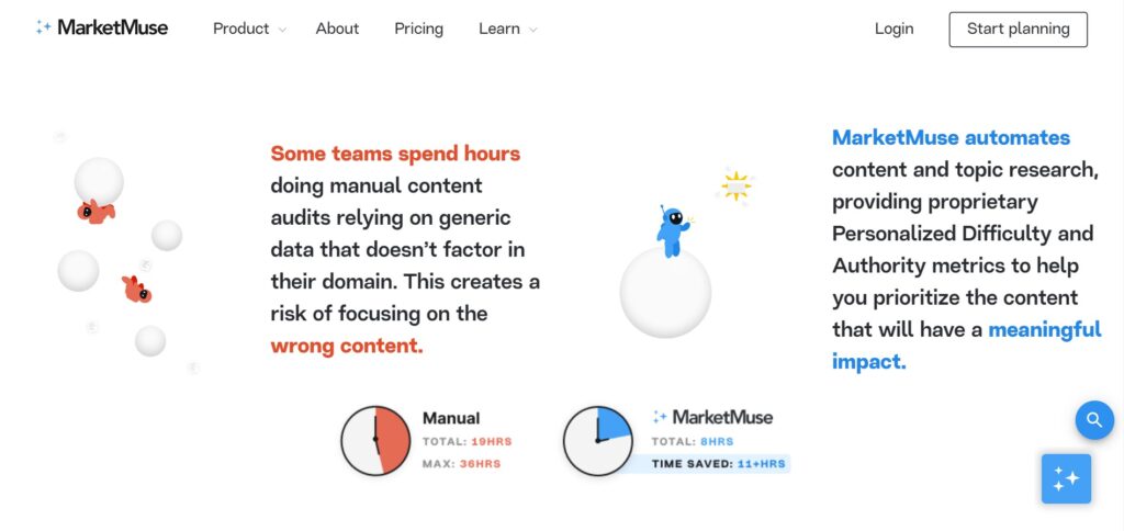
MarketMuse, an AI content optimization SaaS, uses the PAS framework to powerful effect by contrasting their solution with the way their target audience usually does things.
Make your copy more impactful by incorporating techniques like:
- Loss framing: What readers lose if they don’t take action
- Gain framing: What readers gain when they do take action
- Price anchoring: Leading with premium options to make core pricing look affordable
- Scarcity: Highlighting limited availability.
- Urgency: Encouraging action with a time-sensitive offer.
- Risk reduction: Make it as risk-free as possible for visitors to take action.
MarketMuse uses loss framing to highlight the pain associated with not using their service.
Call to Action
Optimizing the call to action is an art unto itself.
One tried-and-true tactic? Keep it simple with a single CTA. Unbounce found that pages with one CTA have a 28% higher conversion rate than those with multiple CTAs.
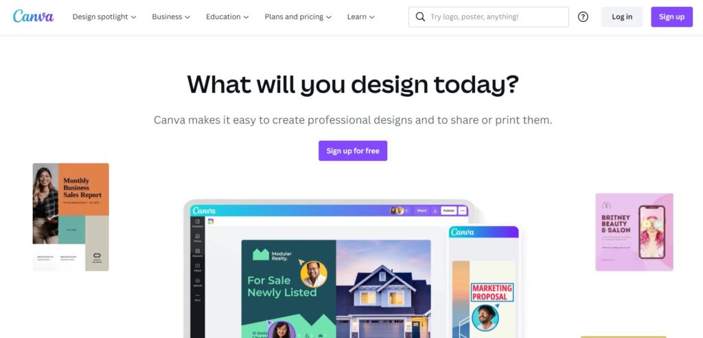
Despite the fact that Canva’s software enables 30+ types of designs, their landing page is tightly-focused and uncomplicated. They have a single, simple call to action and only 23 words above the fold.
A 2018 study by Hubspot found that personalized calls to action convert 202% better than CTAs that aren’t personalized. Personalized CTAs can adapt based on a visitor’s location, language, whether they’ve visited your site before, or whether they’re already a lead.
Global payroll software Deel automatically changes its landing page copy based on the visitor’s IP address.

When your call to action is a form, remember that less is more. Shorter forms (five fields or less) convert up to 34% higher than longer forms.
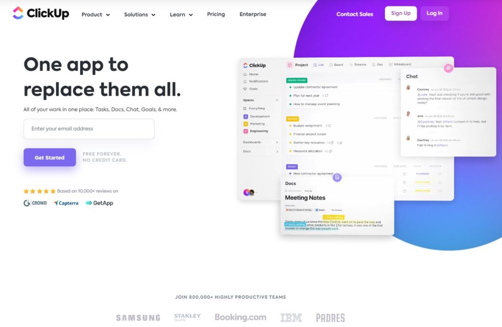
ClickUp takes things one step further by embedding a one-field email form directly under their subheader This reduces friction and removes all obstacles to signing up.
If you need to gather more information, consider multi-step forms.
Venture Harbour found that multi-step forms convert at rates of as much as 200-300% higher than lengthy one-step forms. Multi-step forms reduce overwhelm by asking only one question at a time, and reduce friction by starting with easy, non-invasive questions.
Using AI for Landing Page Optimization
Traditional A/B testing for landing pages works like this:
- Two versions of a page are created.
- Version A is the control. It stays the same.
- Version B includes a single variation. (For example, the headline copy might change.)
- Version A and Version B receive equal traffic for the duration of the test.
The challenge is that this process is slow and requires substantial traffic. Frustratingly, you can only test one variable at a time. You’re also not getting any benefits from optimization while you’re running the test.
The latest AI-powered landing page optimization tools are changing this.
Here’s how a tool called ABtesting.ai works:
- You input your landing page URL.
- The AI suggests multiple variations of your title, copy, and call to action.
- During the test, the most successful variants will quickly be shown more often.
- After the test, a mix of the most successful variants is queued up for the next batch of tests.
The end result? You get the benefits of A/B testing faster and with less effort.
Smart Traffic is Unbounce’s AI-driven A/B testing tool. Landing pages using Smart Traffic get up to 30% more conversions, and can optimize with as few as 50 visits. The system understands which landing page variants perform best for each visitor, and can personalize the landing page variant shown based on factors like device type and location.
Even if you’re not using an all-in-one AI landing page optimization tool, using AI tools for your sales copy can make your headlines, calls to action, and sales copy more effective.
Landing Page Optimization Checklist
Landing page optimization is complex, and it’s easy to miss important aspects. Use the below checklist to guide you through your next landing page design and optimization project:
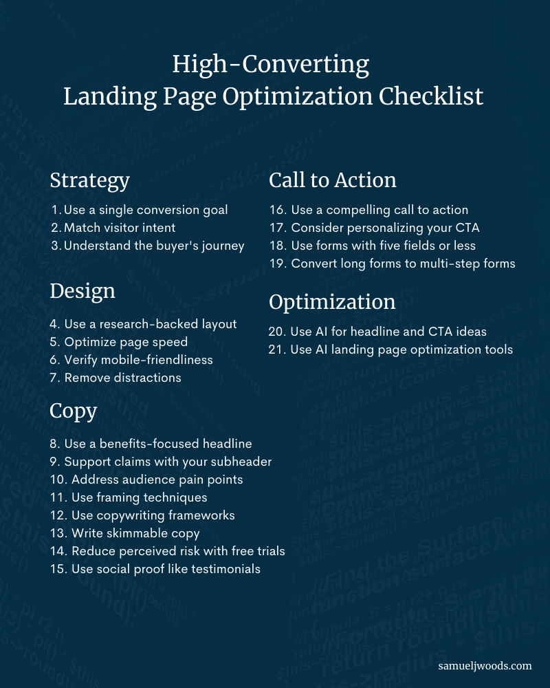
Strategy
- Single Conversion Goal: Design your landing page around a single conversion goal.
- Match Visitor Intent: Make sure your landing page matches your ad copy (for paid ads) or the visitor’s search intent (for organic traffic).
- Buyer’s Journey: Understand where your visitors are in the buyer’s journey. Present an offer that aligns with the stage they’re in.
Design
- Tried-and-True Layout: Use a research-backed text layout like the F-shaped pattern.
- Page Speed: Make sure page speed isn’t causing users to bounce before they have a chance to read your copy.
- Mobile-Friendliness: Run your landing page through Google’s mobile friendly test. Make sure it’s just as easy to convert on mobile devices.
- Remove Distractions: Remove anything that detracts from your conversion goal. This may include navigational elements, footer links, sidebars, and videos that don’t directly contribute to conversion.
Copy
- Headline: Describe a clear, compelling benefit to the user.
- Subheader: Support the claims made by the headline.
- Pain Points: Understand your audience’s pain points and objections. Address them directly in your copy.
- Psychological Techniques: Use loss framing, gain framing, price anchoring, scarcity, and urgency to nudge your visitors toward action.
- Copywriting Frameworks: Use a copywriting framework like Problem-Agitate-Solution (PAS) to reinforce your value proposition.
- Skimmable Copy: Users read 20-28% of the content on your page. Make sure key takeaways are highlighted even while skimming your copy.
- Reduce Risk: Reduce the perceived risk of action with free trials and money-back guarantees.
- Social Proof: Improve your perceived authority with testimonials, client logos, star ratings, and user statistics.
Call to Action
- Compelling CTA: Make sure your CTA is attractive and easy to take action on.
- Personalization: Personalized CTAs convert 202% better. Personalize your CTA based on the user’s location, device, or whether they’ve visited the landing page before.
- Shorten Forms: Forms with five or fewer fields convert 34% better.
- Multi-Step Forms: If you need more than five fields, test multi-step forms.
Optimization
- Test Multiple Headlines: Use AI copywriting tools to test multiple high-converting headlines and CTA options.
- Use AI Landing Page Optimization Tools: Skip traditional A/B testing. Instead, test multiple variants at one time using AI landing page optimization tools.
Mastering Landing Page Conversion Optimization
Landing page optimization is a quickly-evolving field, as evidenced by the impact of artificial intelligence on long-established A/B testing methods.
With so many things you could be doing to optimize your landing page, it’s easy to feel overwhelmed.
But one thing will always be true:
The best landing pages always present enticing offers to users who need them.
When you understand your audience’s pain points and objections, create copy that addresses them, and present a single compelling offer, you’re already on the path to a high-converting landing page.
Once you get the fundamentals right, it’s just a matter of testing, experimenting, and refining.