
I’ve seen it a thousand times. You spend a fortune on ads, drive traffic to a product page, and then… nothing. The conversion rate is a rounding error. It feels like you’re just lighting money on fire. The problem isn’t your product or your traffic; it’s your landing page. It’s not converting visitors into buyers.
For years, I've used machine learning to analyze what separates a page that converts at 1% from one that hits 5% or more. It’s not magic. It’s a replicable system of trust signals, offer framing, and friction reduction. Understanding the core principles of how to improve ecommerce conversion rates is the first step, but seeing those principles in action is what creates real growth.
This article isn't a gallery of pretty designs. It’s a strategic breakdown. You and I are going to dissect 7 high-performing ecommerce landing page examples from brands like Dollar Shave Club, Peloton, and Glossier. For each example, complete with screenshots and direct links, I'll show you the exact conversion mechanics at play.
More importantly, I'll give you specific, AI-driven prompts and workflows to adapt these winning strategies for your own brand. You will learn how to turn your product pages from leaky buckets into automated revenue engines that give you a serious competitive advantage. Let's get started.
1. Dollar Shave Club — “$8 Starter Set” offer page
Converting a one-time buyer into a subscriber is the holy grail for many ecommerce brands. Dollar Shave Club’s starter set page is a masterclass in making the subscription model feel like the only logical choice. It’s one of the best ecommerce landing page examples because it doesn't just sell a product; it sells a smarter, more convenient way to buy.
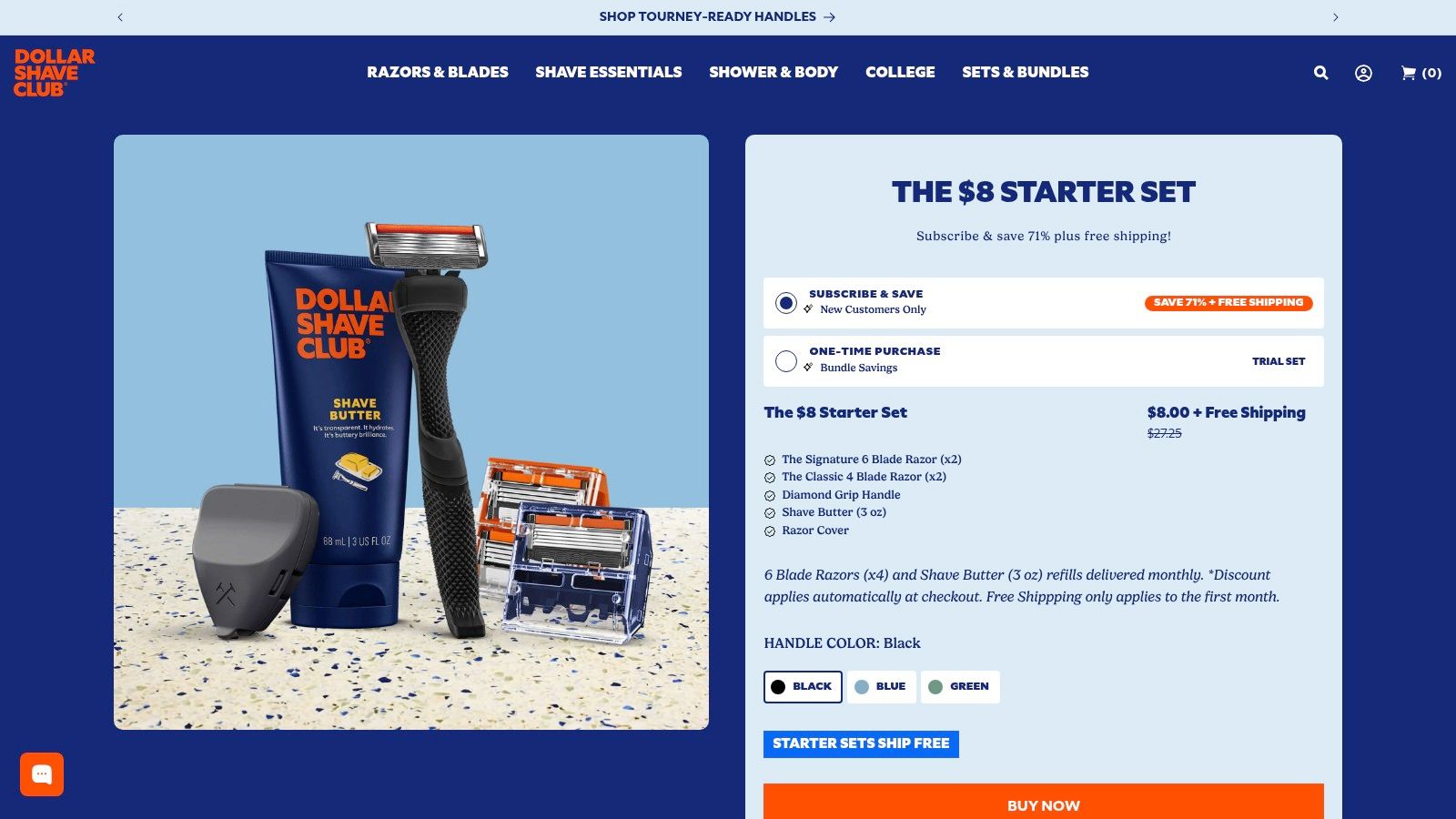
They accomplish this through brilliant offer framing and risk reversal, guiding the user's decision-making process from the moment they land on the page. You're not just comparing products, you're comparing buying models, and one is clearly positioned as superior.
Analysis: What Converts on This Page
The page’s persuasive power comes from a few key elements working in concert.
First, aggressive price anchoring. The headline immediately frames the value: "$8 Starter Set." But the real work happens in the dual-CTA section. The "Subscribe & Save" option is pre-selected, visually highlighted, and displays a massive "Save 71%" callout. The one-time purchase, by contrast, feels expensive and inefficient.
Strategic Insight: This is a classic "decoy effect." By presenting a less attractive one-time purchase option, Dollar Shave Club makes the subscription feel like an undeniable bargain. The user feels smart for choosing it, which increases conversion and long-term commitment.
Second, they visually de-risk the purchase. A clean graphic shows exactly what’s in the box, and a simple "How It Works" section explains the subscription process in three steps. This transparency eliminates ambiguity about what happens after you click "buy," a major point of friction for subscription services. The 30-day money-back guarantee is the final safety net that removes any lingering hesitation. This approach aligns perfectly with many of the core principles found in landing page optimization best practices.
AI-Driven CRO & A/B Test Ideas
While effective, this page isn't perfect. The presence of multiple starter sets can introduce minor choice paralysis. Let's use AI to refine it further.
- A/B Test Idea #1 (Personalization): Use a pre-landing page micro-survey ("What's your biggest shaving challenge?") to dynamically reorder the starter sets. The AI would then present the most relevant set first, simplifying the choice and boosting relevance.
- A/B Test Idea #2 (Copy Iteration): Feed the current page copy, customer reviews, and your brand voice into a Large Language Model. Use this prompt:
Act as a CRO copywriter. Based on the provided data, generate 5 alternative headlines for the Dollar Shave Club starter set that A/B test a 'convenience' angle vs. the current 'savings' angle. Focus on benefits like "never run out" or "effortless grooming."This helps you test if your audience is more motivated by saving money or saving time.
2. Harry’s — Starter/Trial set landing and PDPs
Harry’s takes a different, yet equally potent, approach to the trial offer model. Instead of focusing solely on the "deal," they build a compelling narrative around product quality and brand authority. This particular landing page is a prime example of how to justify a purchase, even a low-cost trial, by grounding it in tangible quality signals. For a brand in a crowded market, this is one of the best ecommerce landing page examples for building trust quickly.
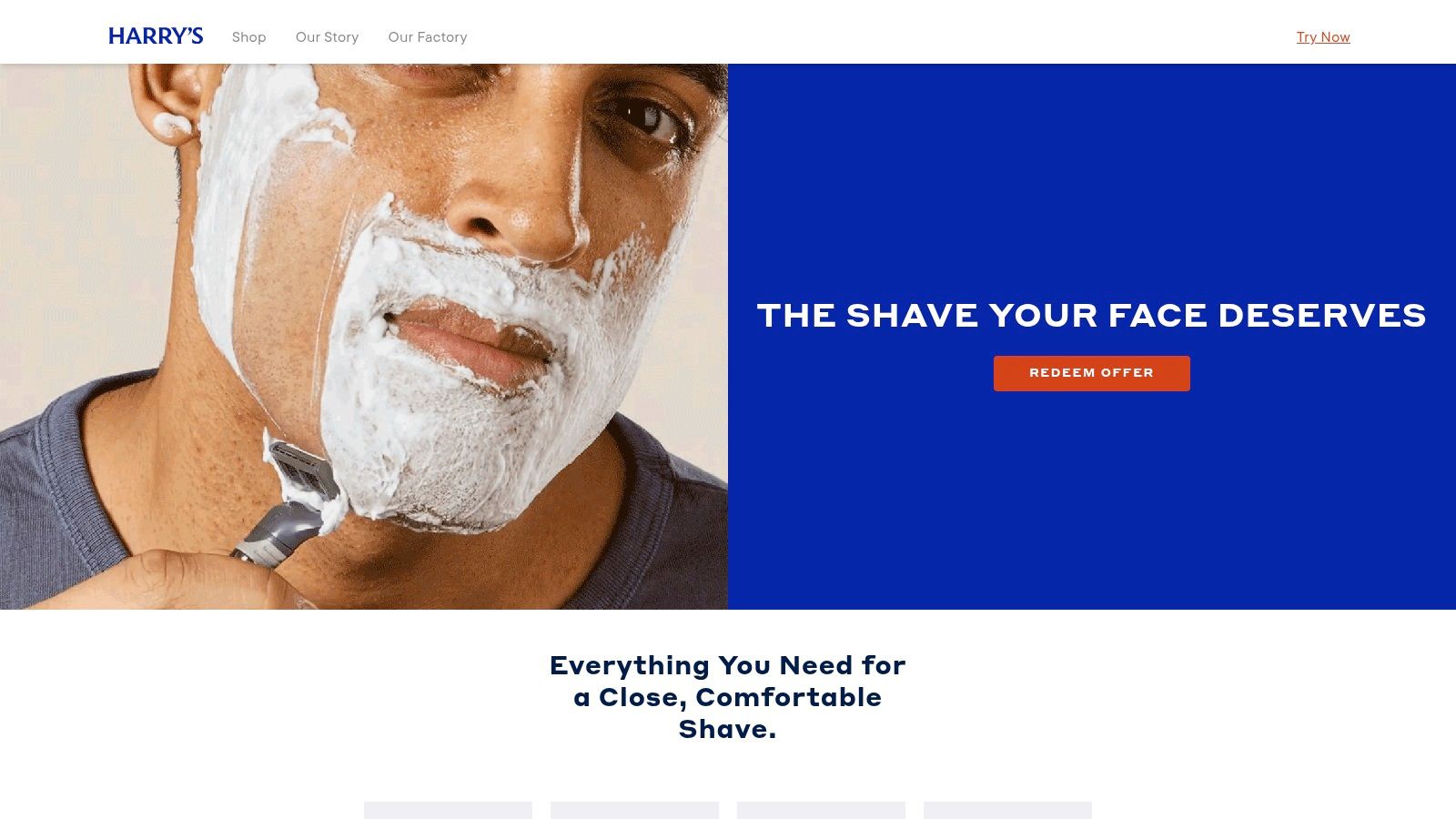
They understand that for a discerning customer, "cheap" can sometimes signal "low quality." Harry’s masterfully counters this perception by weaving in details about craftsmanship and product specifications. The page doesn't just sell you a trial; it sells you on the idea that you’re getting a premium product for an introductory price.
Analysis: What Converts on This Page
The page’s effectiveness hinges on its ability to build perceived value and de-risk the trial simultaneously.
First, story-driven quality signals. The headline "Our sharpest blades ever" is immediately supported by visual spec blocks. These aren't just features; they're proof points. Details like the "flex hinge," "lubricating strip," and "5 German blades" are presented like engineering specs. This technical language elevates the product from a simple commodity to a piece of precision hardware.
Strategic Insight: The most powerful element here is the messaging "We own our own factory in Germany." This is a massive authority play. It instantly answers the unspoken question, "Why are your blades better?" by tying them to a country renowned for engineering. You're not just buying a razor; you're buying into German manufacturing excellence, which reduces perceived risk and justifies the click.
Second, they use channel-specific offer framing. Harry's is known for creating multiple landing page variants tailored to different paid traffic sources. This page, with its clear hero offer module and slashed "was" pricing, is designed to convert cold traffic fast. The "Redeem Trial" CTA is direct and action-oriented, making the user's next step obvious and frictionless.
AI-Driven CRO & A/B Test Ideas
The page is strong, but like any asset, it can be sharpened. The use of multiple landing pages can sometimes lead to brand confusion if a user sees different offers. AI can help us unify and optimize.
A/B Test Idea #1 (Dynamic Content for Traffic Source): Instead of entirely separate pages, use AI to dynamically swap out the hero image and headline based on the referring ad. For example, traffic from a Facebook ad focused on "a comfortable shave" would see a hero image of a man smiling post-shave. Traffic from a Google ad for "best razor blades" would see a close-up of the German-engineered blades. This creates relevance without needing dozens of unique URLs.
A/B Test Idea #2 (Benefit-Driven Copy Test): The current copy is feature-heavy. Let's test a benefit-first approach. Use this prompt with your LLM:
Act as a senior ecommerce copywriter for Harry's. I'm providing you with our current landing page copy, which focuses on product specs like '5 German blades' and 'flex hinge'. Generate 5 alternative copy blocks that translate these features into direct user benefits. For '5 German blades', focus on 'an incredibly close, smooth shave with fewer passes'. For 'flex hinge', focus on 'effortlessly follows the contours of your face'.This test will tell you if your audience responds better to technical specs or emotional outcomes.
3. Purple — Mattress product landing pages
Selling a high-ticket, considered purchase like a mattress online is tough. You're asking someone to commit thousands of dollars to an item they can't physically touch. Purple's product landing pages are a masterclass in systematically dismantling that purchase anxiety. This is one of the top ecommerce landing page examples because it doesn't just present a product; it builds a comprehensive case for it, brick by brick.
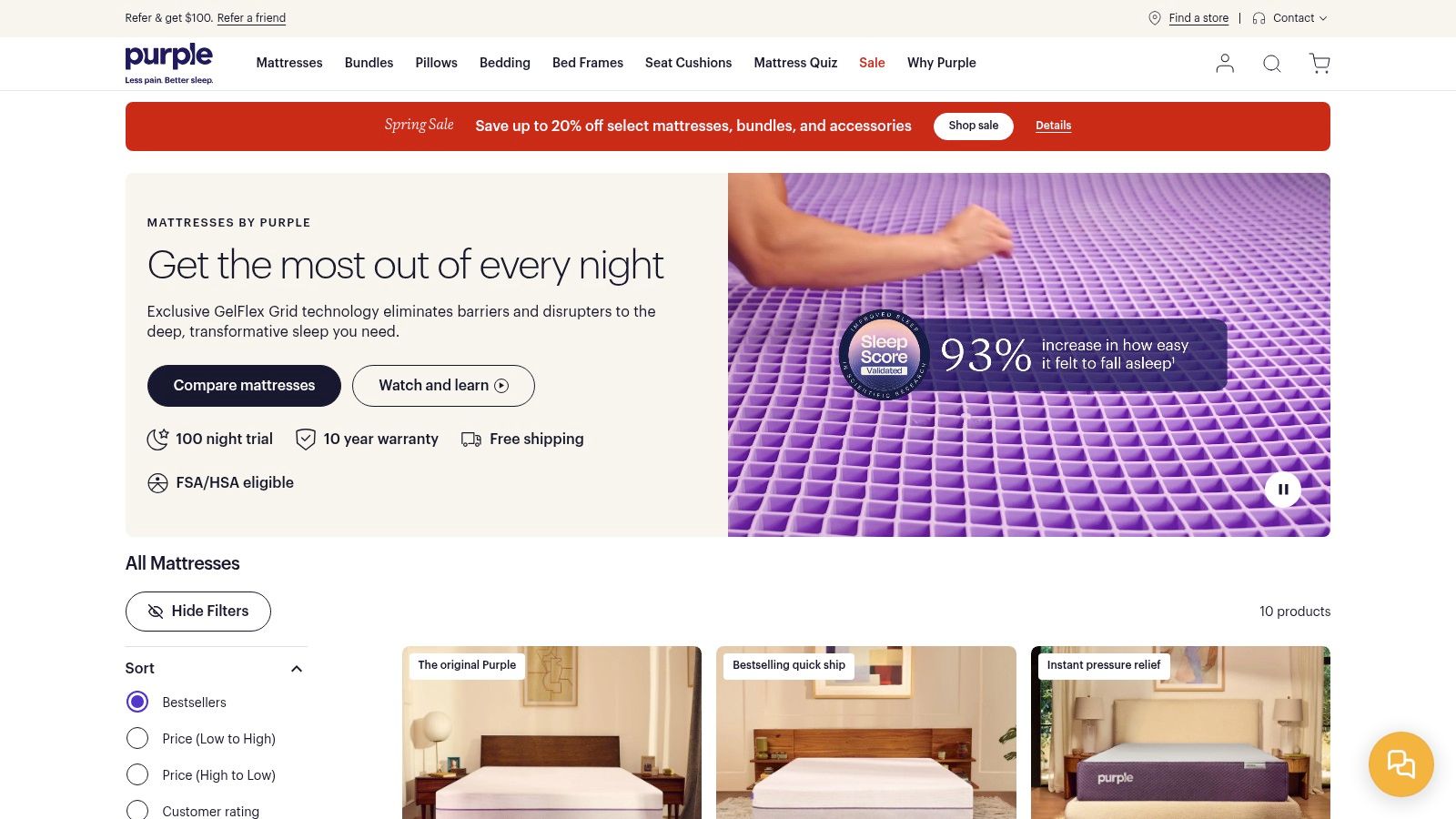
They achieve this by blending deep product education with overwhelming risk reversal. The goal isn't just to inform the user but to make the decision feel safe and logical. For complex products with a high average order value (AOV), this model is directly replicable.
Analysis: What Converts on This Page
The page's success hinges on two core pillars: benefit-driven education and an ironclad safety net.
First, aggressive risk reversal. Right below the fold, Purple presents its "Worry-free guarantee," a powerful block of icons highlighting free shipping, a 100-night trial, and a 10-year warranty. This isn't buried in a footer; it's a primary value proposition. They front-load the answer to the customer's biggest question: "What if I hate it?"
Strategic Insight: For high-AOV items, the cost of returns is dwarfed by the cost of lost sales from purchase anxiety. By making your guarantee a central part of the sales pitch, you neutralize the biggest point of friction. The transparency, including the 21-night minimum before a return, actually builds more trust than a vague policy.
Second, they masterfully translate features into tangible benefits. No one buys a "GelFlex Grid." They buy better sleep. Purple’s page uses clear subheadings, visuals, and concise copy to explain how the grid leads to cooling, pressure relief, and support. This feature-to-benefit mapping is crucial for educating customers on why your proprietary technology is worth the premium price.
AI-Driven CRO & A/B Test Ideas
While powerful, the page is dense and can create some analysis paralysis for shoppers comparing models. Let's use AI to sharpen the user journey.
- A/B Test Idea #1 (Dynamic Content): Deploy a simple entry quiz: "What type of sleeper are you? (Side, Back, Stomach)" or "What's your #1 sleep goal? (Cooling, Pain Relief)." Use the answer to dynamically re-prioritize the feature/benefit sections on the page. An AI workflow can instantly show a side-sleeper the "Pressure Relief" section first, making the page feel personally tailored.
- A/B Test Idea #2 (Review-Fueled Copy): Scrape 500 of your 4 and 5-star reviews for the mattress. Feed them into a Large Language Model with this prompt:
Act as a conversion copywriter. Analyze these customer reviews for a premium mattress. Identify the top 3 most-mentioned benefits and the exact phrasing customers use. Generate 5 new subheadings for the product benefits section using this voice-of-customer data.This will test if customer-generated language converts better than marketing copy.
4. Away — “The Carry‑On Flex” product page
Selling a premium product means justifying a premium price. Away’s product page for "The Carry-On Flex" does this brilliantly by shifting the focus from cost to value. It uses visual storytelling and meticulous detail to make its higher price point feel not just reasonable, but like a smart investment in better travel. This is one of the stronger ecommerce landing page examples for brands in a competitive, price-sensitive market.
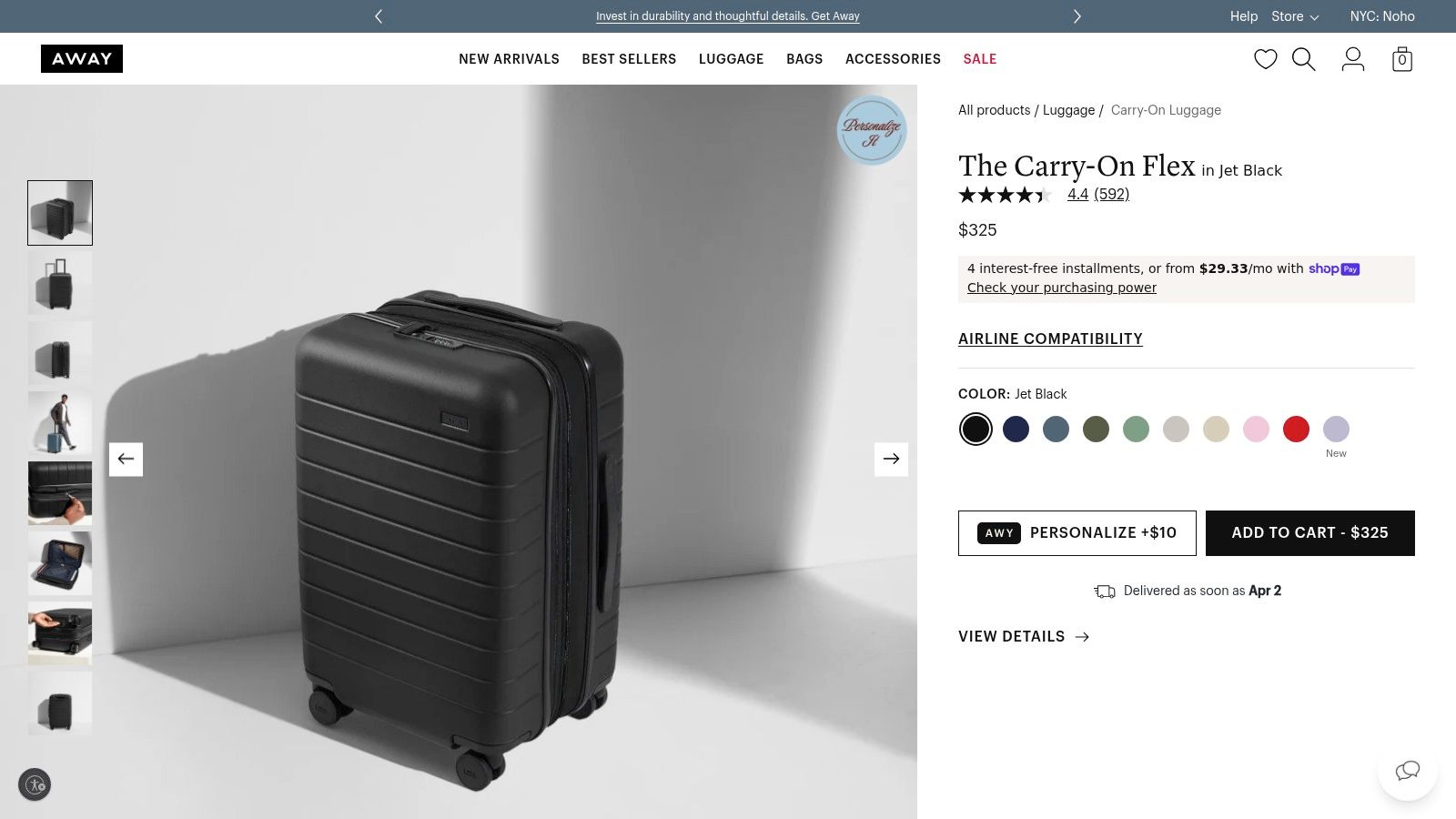
Away understands that for a considered purchase like high-end luggage, a customer's primary questions are about utility and durability. The page is engineered to answer these questions visually before the user even has to ask, making the sale feel like a logical conclusion rather than a hard sell.
Analysis: What Converts on This Page
The page’s effectiveness rests on two core pillars: preemptive question-answering and strong risk reversal.
First, exceptional visual storytelling. Away doesn’t just show you a picture of a suitcase; it shows you exactly how it solves travel problems. A sequence of high-quality images demonstrates its scale next to a person, its interior capacity packed with organizers, and its key feature-the expansion system-in action. This visual proof is far more powerful than a bulleted list of features. It allows the customer to mentally "test drive" the product.
Strategic Insight: For premium physical products, showing is always better than telling. Away uses photography to handle objections. Is it big enough? Will my things fit? How does the 'flex' feature actually work? The images answer these questions instantly, building trust and desire simultaneously.
Second, they build unshakeable post-purchase confidence. A high price tag creates hesitation. Away dismantles this fear with prominent, clear-cut policies: a 100-day free returns window and a limited lifetime warranty. This messaging isn't buried in the footer; it’s placed right near the purchase decision point. It tells the customer, "We stand behind this product so strongly that your risk is effectively zero."
AI-Driven CRO & A/B Test Ideas
While the page excels at showcasing the product, the presence of multiple carry-on models on the site could cause some shoppers to hesitate or browse away. We can use AI to make the decision even easier.
- A/B Test Idea #1 (Dynamic Social Proof): Use an AI engine to analyze review data and dynamically pull quotes that mention specific features. When a user hovers over the "Expandable by 2.25 inches" feature, the AI could surface a real customer review snippet saying, "That extra space was a lifesaver for all the souvenirs I brought back." This connects features directly to real-world benefits using the customer's own voice. You can discover more about these kinds of strategies by exploring the best AI tools for ecommerce.
- A/B Test Idea #2 (Copy Iteration): The current copy is good, but it could be tested for different user motivations. Use a Large Language Model with this prompt:
Act as a luxury travel copywriter. The target audience values durability, style, and effortless travel. Based on the Away Carry-On Flex page, generate 5 new short descriptions for the "Add to Cart" section. Test a 'durability' angle ("Built for a decade of destinations") against a 'status' angle ("The last carry-on you'll ever want to own").This helps you pinpoint whether your premium buyers are more motivated by long-term value or the prestige of the brand.
5. Bombas — Men’s All‑Sport Ankle Socks PDP (mission‑led conversion)
Can you sell socks by selling a mission? Bombas proves you can, and that it’s an incredibly powerful conversion tool. This product detail page (PDP) is one of the top ecommerce landing page examples because it perfectly marries product utility with a powerful, feel-good social cause. It transforms a simple purchase into an act of giving, building a brand moat that's hard for competitors to cross.
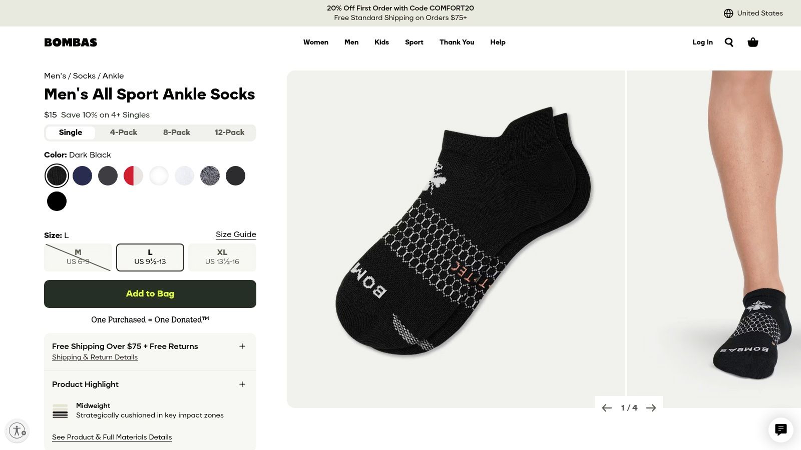
Bombas understands that modern consumers, especially in crowded markets, buy why you do something as much as what you sell. They don't just ask you to buy socks; they invite you to join a movement. This approach turns a commodity product into a statement purchase, increasing both perceived value and brand loyalty from the very first click.
Analysis: What Converts on This Page
The genius of this page is how it stacks value from two different angles: practical savings and emotional satisfaction.
First, incentivized bundling with clear savings. The page defaults to a 4-pack, but immediately presents options for an 8-pack or 12-pack with escalating "Save X%" callouts. The user is nudged toward a higher average order value (AOV) with a clear financial benefit. Free shipping and returns are prominently displayed right below the CTA, reducing purchase friction.
Strategic Insight: This is a masterclass in value stacking. The user gets better socks, saves money on a larger pack, gets free shipping, and contributes to a good cause. Each "yes" in their mind makes the final "Add to Cart" click feel not just logical, but also morally validating. It’s a powerful combination that’s core to many of the best conversion optimization practices.
Second, the mission is the hero. The "One Purchased = One Donated" message isn't a footnote; it’s integrated directly into the buying interface. A running ticker of total donations provides social proof on a massive scale. This isn't just a marketing gimmick; it's the brand’s entire identity, which builds immense trust and makes the price point feel more justified.
AI-Driven CRO & A/B Test Ideas
While powerful, the number of pack and color choices could be overwhelming. We can use AI to make the path to purchase even smoother.
- A/B Test Idea #1 (Dynamic Bundling): Use AI to analyze past purchase data and browsing behavior. For a returning customer who previously bought black socks, dynamically pre-select the 8-pack of black socks instead of the default 4-pack multi-color. This personalization reduces clicks and cognitive load.
- A/B Test Idea #2 (Impact Personalization Copy): Use a Large Language Model to A/B test the mission statement copy. Feed it customer data and your brand voice. Use this prompt:
Act as a CRO copywriter. I'm Bombas. Our core mission is "One Purchased = One Donated." Based on our data, generate 5 alternative copy snippets for our PDP that test a 'localized impact' angle vs. the current 'global impact' angle. For example, "Help us donate socks in your state" vs. "100+ million items donated."This helps you test if customers are more motivated by a local or a global impact story.
6. Glossier — “The Dewy Look” set page
In a crowded beauty market, simplicity sells. Glossier’s "The Dewy Look" landing page is an exceptional ecommerce landing page example because it rejects information overload. Instead of overwhelming you with choices, it presents a curated, high-value bundle that feels like an expert recommendation, making the purchase decision fast and effortless.
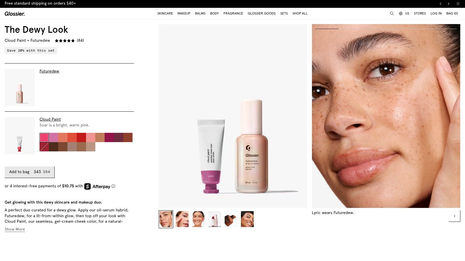
They achieve this by packaging a desired outcome, "The Dewy Look," rather than just selling individual products. This approach reduces cognitive load and frames the purchase around a result, not a feature list. You’re not just buying makeup; you’re buying a specific, popular aesthetic with one click.
Analysis: What Converts on This Page
The genius of this page is its speed and clarity, driven by two core conversion tactics.
First, aggressive bundling and savings framing. The page immediately shows the kit price alongside a crossed-out higher price, making the "Save $6" benefit impossible to miss. This simple visual cue communicates value instantly. The entire page is designed to sell the kit, not just the individual items, which increases the Average Order Value (AOV) by default.
Strategic Insight: This is product bundling as a form of choice architecture. By pre-selecting complementary products into a desirable "look," Glossier removes the analysis paralysis of building a routine from scratch. You feel like you're getting an insider deal on a curated set, which feels both smart and convenient.
Second, the page features an elegant, inline shade selection UX. Instead of forcing you to new pages or complex pop-ups, the shade pickers for both products are integrated directly into the main product block. This frictionless process keeps you on the path to purchase without any jarring interruptions. It respects your time and keeps the focus squarely on completing the order.
AI-Driven CRO & A/B Test Ideas
While the minimalist approach is effective, it might leave some customers wanting more educational content. We can use AI to add depth without adding clutter.
A/B Test Idea #1 (Dynamic Social Proof): Use an AI tool to pull in and display User-Generated Content (UGC) based on the selected shades. When a user picks a Cloud Paint shade, the AI would dynamically populate a small module below with Instagram or TikTok photos of real customers wearing that exact shade. This adds powerful, hyper-relevant social proof right at the point of decision.
A/B Test Idea #2 (Copy Iteration): The current copy is minimal. Let’s test if a more benefit-driven approach converts better for new customers. I would feed an LLM the product details, reviews highlighting ease of use, and our target persona. My prompt:
Act as a senior copywriter for a top-tier beauty brand. Using the provided data, write 3 alternative short descriptions for "The Dewy Look" kit. The goal is to A/B test the current minimalist copy against versions that emphasize '5-minute routine,' 'glass skin secrets,' or 'effortless glow.' Keep it under 15 words.This lets us test if framing the kit as a time-saver or a secret weapon resonates more.
7. Peloton — Equipment and special‑pricing landing (membership + financing)
Selling a premium, high-consideration product like a Peloton bike isn't like selling a razor. The financial commitment is substantial, and the ecosystem of hardware, software, and membership can feel complex. Peloton's equipment landing pages are a powerful example of how to make an expensive, multi-faceted purchase feel manageable and even desirable. They do this by breaking down barriers to entry with total transparency.
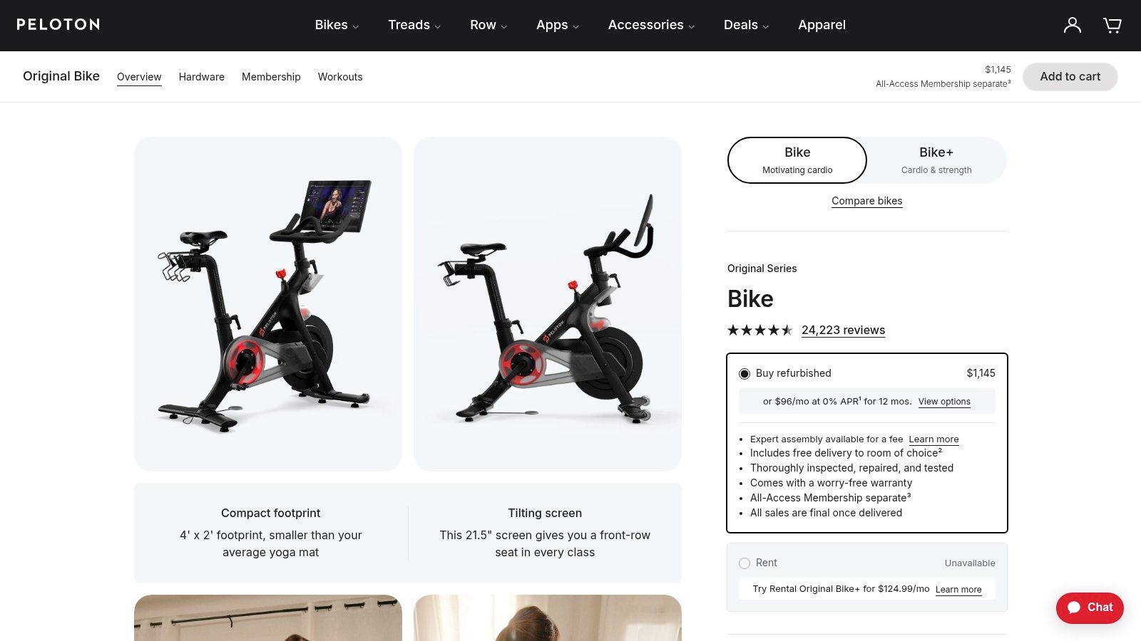
This page is one of the best ecommerce landing page examples because it doesn't shy away from the price tag. Instead, it systematically dismantles every potential financial and logistical objection a buyer might have, turning a complex decision into a series of clear, simple choices. It meets the customer where they are, whether they're ready to buy outright or need more flexible options.
Analysis: What Converts on This Page
The page’s effectiveness comes from its direct approach to tackling purchase friction.
First, it normalizes monthly payments over a high one-time cost. The most prominent price displayed isn't the full four-figure sum; it's the much more digestible monthly financing option. This reframes the purchase from "Can I afford $1,445 today?" to "Can I afford $30 a month?" a question with a much lower psychological hurdle. The full price is still there, but it's de-emphasized.
Strategic Insight: For high-ticket items, leading with financing is a proven CRO tactic. It anchors the perceived cost to a smaller, recurring number, making the product feel more accessible. Peloton masters this by integrating the financing offer directly into the primary call-to-action, not as an afterthought.
Second, the page proactively segments acquisition paths. It offers clear, distinct options for buying new, refurbished, or even renting (in select markets). This acknowledges that not all customers are the same. Some want the latest model, while others are more price-sensitive. By providing these paths upfront, Peloton keeps budget-conscious users on the page instead of losing them to sticker shock. This multi-path approach, combined with special pricing for groups like students and healthcare workers on dedicated landing pages, builds immense trust.
AI-Driven CRO & A/B Test Ideas
While the page is strong, the sheer number of options could still be overwhelming. We can use AI to guide users to the best path for them.
- A/B Test Idea #1 (Interactive Quiz): Instead of static tabs, implement a short, AI-powered quiz at the top of the page. Ask 2-3 questions: "What's your approximate monthly fitness budget?" and "Is having the latest model a must-have for you?" Based on the answers, the AI would dynamically highlight the most suitable option (New, Refurbished, Rental) and hide the others, reducing choice overload.
- A/B Test Idea #2 (Social Proof Personalization): Feed customer testimonials and their associated purchase path (e.g., "Jane D. bought Refurbished," "Mike S. chose financing") into a generative AI model. Use this prompt:
Act as a social proof copywriter. Based on these testimonials, create 3 short, benefit-driven snippets for a "Why Peloton" section. For each, dynamically insert the most relevant testimonial based on the user's on-page behavior (e.g., if they click the 'Refurbished' tab, show a testimonial from a happy refurbished bike owner).This tailors social proof to the user's interest, making it far more persuasive.
7 Ecommerce Landing Page Comparison
| Example | Implementation complexity | Resource requirements | Expected outcomes | Ideal use cases | Key advantages |
|---|---|---|---|---|---|
| Dollar Shave Club — “$8 Starter Set” | Medium — standard LP with dual CTAs and risk blocks | Low–Medium — design, copy, bundle visuals, basic testing | High subscription conversion via price anchoring and clear value math | Consumable products aiming to convert first purchase into subscription | Strong price anchoring, clear friction reducers, simple value math |
| Harry’s — Starter/Trial set landing and PDPs | Medium — multiple LP variants and product spec blocks | Medium — tailored creatives, product specs, segmentation and CRO | Improved paid-traffic relevance and higher trial conversions | Low-cost trials where product quality and provenance reduce risk | Channel-specific variants, clear quality narrative and product detail |
| Purple — Mattress product landing pages | High — long-form education, stacked benefits, policy detail | High — rich content, technical demos, customer support alignment | Reduced hesitation for high-AOV purchases and lower return rates | High-ticket, considered purchases needing deep education and guarantees | Robust risk reversal, clear feature-to-benefit mapping, policy transparency |
| Away — “The Carry‑On Flex” product page | Medium–High — image sequencing and lifestyle storytelling | High — professional photography, interactive imagery, variant content | Higher conversion on premium price points; fewer sizing/packing questions | Premium lifestyle goods where visuals and fit inform purchase | Exceptional photography, strong post-purchase assurances, storytelling |
| Bombas — Men’s All‑Sport Ankle Socks PDP | Low–Medium — straightforward PDP with mission and bundles | Medium — pack-builder UX, impact messaging, size guides | Increased AOV via bundles and higher trust from cause marketing | Mission-driven consumables and multi-pack upsells | Cause marketing boosts trust; clear multi-pack savings and simple UX |
| Glossier — “The Dewy Look” set page | Low — compact kit page with minimal decision steps | Low — concise copy, simple shade picker, clean imagery | Fast conversions and low friction; streamlined kit purchases | Beauty kits and low-consideration bundled SKUs | Fast path to purchase, reduced choice fatigue, clear kit savings |
| Peloton — Equipment and special‑pricing landing | High — many acquisition paths, financing and eligibility flows | High — financing integrations, segmented LPs, detailed specs and policies | Higher completion for premium purchases; clearer economics for buyers | Complex product ecosystems with financing, membership and tiering | Transparent pricing/options, audience-specific LPs, multiple purchase paths |
Your Next Step: Building an Unfair Advantage
We've just walked through seven powerful ecommerce landing page examples, but I want to be clear. This isn't just a gallery for inspiration. It's an operational manual for building a conversion machine.
You saw how Dollar Shave Club and Harry’s master the low-risk entry offer. You witnessed Purple's masterclass in de-risking a high-consideration purchase with social proof and a bulletproof guarantee. These aren't just pretty designs; they are meticulously crafted psychological funnels.
Each example, from Away's feature-driven clarity to Bombas's mission-led connection, is a case study in market dominance. They win because they understand the customer’s mind. They anticipate objections, stack value until the price feels insignificant, and make the "add to cart" click an easy, logical conclusion.
From Analysis to Action: Your AI-Powered Playbook
Your competitors are looking at these same pages. They’re probably telling their designers to “make it look more like that.” That is a losing strategy. You have an advantage because you understand the why behind the what. You have the frameworks and AI prompts to go deeper.
Your next step isn’t a redesign. It's a deconstruction.
Run a Systems Audit: Take your most critical landing page. Apply the AI prompts from the Purple mattress example to analyze your risk-reversal strategy. Are your guarantees visible? Are they powerful enough? Use the Glossier prompts to evaluate how you’re bundling products to increase Average Order Value.
Identify Conversion Friction: Use the AI Agent workflows we discussed to simulate a first-time visitor. Where does the user journey snag? Is your value proposition as instantly clear as Dollar Shave Club's "$8 Starter Set"? Where is the cognitive load too high?
Implement One High-Impact Change: Don't try to fix everything at once. Choose one principle from this article and apply it. It could be strengthening your primary CTA, adding a more prominent customer testimonial block, or clarifying your financing options like Peloton. Test it. Measure the result. Then repeat.
Choosing Your Tools and Building Your Stack
The tools you choose will dictate your speed and precision. If you’re a solo founder or a small team, starting with a user-friendly platform like Shopify with a premium theme is often enough to implement many of these visual and copy tactics.
For teams ready to scale and optimize seriously, a more advanced stack is necessary. This means integrating a dedicated landing page builder like Unbounce or Instapage for rapid A/B testing, alongside a CRO tool like Hotjar or Microsoft Clarity to get qualitative data on user behavior.
The real force multiplier, however, is the AI layer. Using tools like Jasper for copy variations or custom GPTs built for CRO analysis lets you execute the strategies we’ve discussed at a scale your competitors can’t match. This isn’t about replacing your team; it's about giving them an unfair advantage.
The ecommerce landing page examples in this article are a starting point. They show what’s possible when great marketing meets systematic execution. By applying these principles, you're not just hoping for more sales. You're building a system that predictably generates them, creating a moat around your business that is incredibly difficult for others to cross. Now, go build it.