
You've probably already got a dashboard. Maybe several.
One lives in GA4. One sits in HubSpot. One's in Tableau or Looker Studio. Your paid team has another view in Google Ads and Meta. Finance has a spreadsheet they trust more than all of them. Every Monday, someone still builds slides by hand because nobody believes the same numbers for the same question.
That's the problem with most marketing analytics dashboards. They don't fail because dashboards are useless. They fail because they're built to display information instead of driving decisions. I've been working with machine learning since 2016 and generative AI since 2019, and I can tell you the companies that move fastest don't necessarily have more data. They have tighter decision loops.
I'm Samuel Woods. If you want a dashboard that helps you grow revenue, defend spend, and spot market shifts before competitors do, you need to build it like an operating system. Not a reporting artifact. Not a vanity wallboard. A system your team uses to decide what to scale, what to cut, and where AI should be watching for you.
Your Dashboard is a Graveyard of Dead Data
I've seen companies spend serious money on BI tools, connectors, and implementation time, then end up with a screen nobody opens after the launch meeting. The charts are polished. The filters work. The data technically exists. But the dashboard is dead because it never answered the only question that matters.
What decision will this change this week?
Modern marketing analytics dashboards became standard because teams moved from fragmented channel reporting to unified, real-time views that pull from web analytics, ad platforms, and CRMs into one operational layer for tracking the full funnel according to Piwik PRO's glossary. That matters, but many organizations stop at consolidation. They confuse “all the data in one place” with “clarity.”
Why most dashboards die
The failure usually starts at kickoff. Someone asks what data is available. Someone else asks what tool to use. Then the team starts wiring APIs before anyone has defined the business objectives. That's backwards.
A healthy dashboard starts with a narrow set of executive questions:
- Budget question: Where should we move spend right now?
- Funnel question: Where are conversions leaking?
- Revenue question: Which channels are producing profitable customers, not just traffic?
- Risk question: What changed that needs attention before it becomes a missed month?
If your dashboard can't answer those fast, it's decoration.
Practical rule: If a metric doesn't trigger a decision, it doesn't belong on the main dashboard.
What CEOs actually need
You don't need another reporting layer that celebrates activity. You need one that reveals effectiveness. I want the CEO to open the dashboard and know, in seconds, whether acquisition is efficient, whether conversion is improving, and whether the pipeline behind reported revenue is healthy.
That's also why I push leaders to review their dashboard stack the same way they review tools. If your reporting environment is fragmented, your decision-making will be fragmented too. I wrote more about that in my guide to marketing intelligence tools, because dashboards only work when they sit inside a broader intelligence system.
The right mindset
Build the dashboard for conflict, not comfort.
You want it to surface bad news early. You want it to make channel owners uncomfortable when a campaign burns cash. You want it to show whether growth is real or just dressed-up click volume. If everyone can look at the dashboard and feel good while revenue stalls, the dashboard is lying by omission.
That's why I treat marketing analytics dashboards as competitive infrastructure. The company that sees change first and acts first usually wins. The one still stitching screenshots together is already behind.
Anchor Your Dashboard to Revenue Not Vanity
It's Monday morning. The CEO opens the dashboard, sees traffic up, clicks up, and lead volume up, then approves more spend. Two weeks later, sales quality is down, CAC is climbing, and revenue misses plan. That dashboard did not support a decision. It helped justify a bad one.
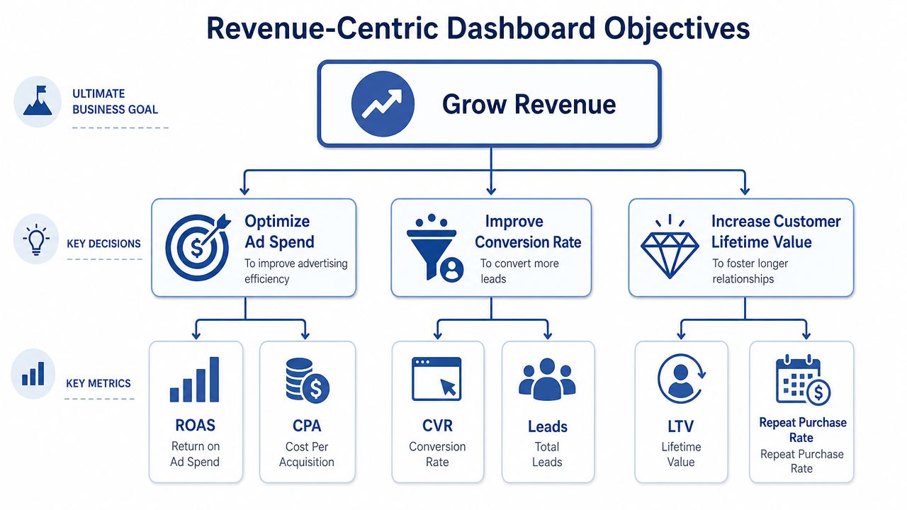
Start with the decisions that control growth. Should you increase paid spend this week? Which channel is producing profitable customers? Where is conversion slowing enough to threaten next month's revenue? Build the dashboard around those calls, then choose the metrics that answer them.
A strong dashboard ties business goals to a tight KPI set and then pulls in the systems required to measure performance accurately, including CRM, email, ads, and web analytics as recommended by FusionCharts. Skip that order and you get a screen full of charts with no financial value.
The KPI stack I'd use
Keep the top layer brutally small. A CEO needs outcomes, efficiency, and early warning signs. Nothing else belongs on the main view.
Revenue by channel
This shows where growth is coming from.Customer acquisition cost
Rising CAC is an early sign that scale is getting more expensive than it looks.Return on ad spend
ROAS is a pressure gauge for paid media. It should never be read in isolation, but it still earns its place.Conversion rate
Conversion improvement often creates more profit than buying more traffic.Average order value or deal value
This reveals whether growth is coming from better monetization, not just more demand.Retention or customer quality signal
Acquisition looks great right up until churn exposes it.
The rule is simple. If a metric can improve while profit gets worse, push it out of the executive view. Traffic, impressions, open rates, and social engagement belong in supporting tabs unless they clearly predict revenue.
Leading indicators earn their spot
Executives need lagging indicators to judge performance and leading indicators to change it. Closed revenue and realized CAC confirm what happened. Qualified pipeline creation, demo request quality, trial activation, and sharp conversion shifts show what is about to happen.
The dashboard can stop being a rearview mirror. Add an AI layer that flags anomalies, forecasts likely outcomes, and answers plain-English questions such as: Why did paid search CAC jump this week? Which channel is most likely to miss target by month-end? What changed in the funnel before pipeline slowed? Reporting alone is too slow. Insight generation is the advantage.
A useful dashboard helps you intervene before the miss shows up in finance.
Time comparisons matter for the same reason. Show month-over-month and year-over-year movement so leaders can spot deterioration early, not stare at isolated numbers and guess.
Cut metrics until it hurts
If your executive dashboard has fifty widgets, it is built for spectators, not operators.
Use four layers:
- Executive summary for revenue, efficiency, pacing, and forecast risk
- Channel view for spend, return, and acquisition quality
- Funnel view for conversion diagnosis
- Campaign view for in-flight execution and testing
Everything else needs a hard justification.
If you're under pressure to prove marketing's value, this discipline matters. Budget defense does not come from impressions or opens. It comes from showing how spend turns into pipeline, revenue, margin, and the next best action.
I've laid out the operating logic in more detail in this guide on how to improve marketing ROI. Keep the standard high. Your dashboard should show where money is made, where it is lost, and what your team needs to do next.
Map Your Data Before You Touch a Tool
Monday morning. Your leadership team is looking at a dashboard that says pipeline is healthy, paid media is efficient, and revenue is on pace. By Wednesday, finance finds the opposite. Nothing destroys confidence faster than a dashboard that looks precise and is wrong.
A bad dashboard does more than confuse people. It trains the company to trust bad decisions.
Start with a source map
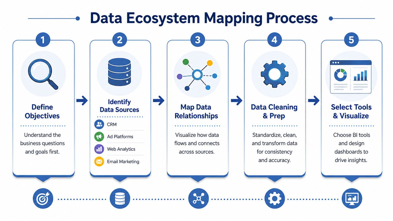
Before anyone opens Tableau, Power BI, Looker Studio, or any AI dashboard app, map the system in plain English. I want to see where each metric starts, how it gets transformed, where it joins another source, and how often it updates. If your team cannot explain that on one page, they are not ready to build.
Your map should cover:
- CRM data such as lifecycle stage, lead source, opportunity status, pipeline amount, and closed revenue
- Ad platform data from Google Ads, Meta, LinkedIn, and other paid channels
- Web analytics data from GA4 or your analytics stack
- Email and automation data from HubSpot, Klaviyo, Mailchimp, or similar
- Revenue data from Shopify, Stripe, your billing system, or finance exports
Keep it simple. Show the source, owner, refresh cadence, join key, and known limitations for each system.
That last part matters. AI can spot anomalies, forecast shortfalls, and answer natural language questions, but it cannot rescue broken inputs. If campaign names are inconsistent, revenue arrives late, or conversions duplicate across platforms, your AI layer will automate bad conclusions at machine speed.
Define the metric logic before the visuals
Executives do not need another chart. They need numbers that survive scrutiny from finance, sales, and the board.
Write down the exact formula for every KPI that matters. What counts as pipeline created? Which date field defines revenue? How do you handle refunds, canceled deals, offline conversions, and multi-currency reporting? If those rules live in someone's head, your dashboard is a political argument disguised as software.
Use a short KPI spec for each metric:
- Business definition: What the metric means to the company
- Formula: How it is calculated
- Source systems: Where the inputs come from
- Refresh frequency: How current it is
- Owner: Who approves changes
- Caveats: What can break or distort it
The beginning of effective predictive reporting depends on specific factors. Forecasting only works when the underlying metric definitions stay stable. Anomaly detection only works when the baseline is real.
Clean your taxonomy before you build views
Many marketing teams sabotage the dashboard before the first chart is built. One platform says "Meta Ads," another says "facebook_paid," and a third says "paid-social." Now your rollups are wrong, your CAC by channel is wrong, and every meeting turns into a debate about labels instead of action.
Fix the taxonomy first.
My minimum standard:
- UTM discipline: Standardize source, medium, campaign, content, and term rules
- Naming consistency: Use one format for campaigns, channels, offers, regions, and audiences
- Deduplication: Remove repeated conversions, transactions, and contacts before they hit executive reporting
- Currency normalization: Convert values before calculating efficiency or contribution
- KPI grouping: Assign each metric to the executive, channel, funnel, or campaign layer
Small naming problems create expensive reporting problems. The CEO sees channel performance. Finance sees channel allocation. The AI assistant sees patterns in the data model you gave it. If the taxonomy is messy, every output gets weaker.
Do not let the tool dictate the model
Vendors sell speed. You need control.
The wrong build sequence looks like this:
| Bad sequence | Better sequence |
|---|---|
| Pick tool | Define business objectives |
| Connect sources | Define KPI logic |
| Build charts | Standardize naming and tracking |
| Debate data quality later | Verify freshness, joins, and attribution early |
The tool should serve the model. The model should serve the business.
That sounds obvious. Companies still get it backward all the time because connectors make early progress look real. Then the team discovers missing fields, broken joins, stale syncs, and attribution logic that does not match how the business sells. Rework follows. Trust drops. Adoption stalls.
If your team says, "we'll clean the data after the dashboard is live," they are telling you the first version will be untrustworthy.
If you need a simple way to align objective, channel, message, and measurement before implementation, use a marketing campaign planning template. It forces the reporting logic to match the campaign plan before anyone starts building charts.
Design for a 30-Second Glance
Your dashboard doesn't need to be clever. It needs to be instantly legible.
The CEO is not opening it to admire your filters. They're scanning for one thing first. Are we on track or not? If the answer isn't obvious inside half a minute, the design failed.

Use the inverted pyramid
I like an inverted pyramid layout because it mirrors how executives think.
Put the most important business outcome at the top left. That might be revenue, blended CAC, pipeline created, or ROAS depending on the business model. Then move right and downward into trend context, channel breakdowns, and diagnostics.
A strong visual flow usually looks like this:
Top row
Outcome KPIs. Big, simple, impossible to miss.Middle row
Trend lines and channel comparisons. What changed, and where?Bottom row
Diagnostic detail. Which campaign, audience, offer, or landing page caused it?
This is not about aesthetics. It's about speed.
Match the chart to the question
The wrong visualization slows decisions. The right one makes the answer feel obvious.
Use this cheat sheet:
- Line charts for performance over time
- Bar charts for comparing channels or campaigns
- Scorecards for single KPI snapshots
- Tables only when someone needs ranked detail
- Funnel visuals when you're showing stage drop-off
Don't use decorative junk. No 3D charts. No rainbow color coding. No pies trying to compare too many categories. Every design choice should reduce interpretation effort.
Good dashboard design removes the need for explanation in the meeting.
A useful walkthrough of dashboard thinking is below. Watch it with one question in mind. Would my current layout survive a hostile executive review?
Build narrative into the layout
A dashboard should answer three things in order:
| Question | What the dashboard should show |
|---|---|
| What happened | Core KPI movement |
| Why it happened | Channel, campaign, or funnel breakdown |
| What to do next | Clear underperformers and opportunities |
That last part gets missed constantly. Teams stop at diagnosis. They don't design for action.
So add directional cues. Show top and bottom performers. Highlight anomalies. Add pacing indicators. Put the “last updated” timestamp where a human can see it. If users have to guess whether data is fresh, they won't trust the page.
Tool choice matters less than generally perceived here. Tableau, Power BI, Looker Studio, and other BI tools can all produce a strong dashboard if the model and layout are disciplined. Weak dashboards are rarely a software problem. They're usually a thinking problem.
Automate Insights with an AI Co-Pilot
A static dashboard is already old by the time someone reads it. That's the uncomfortable truth.
Most dashboards still behave like passive displays. They wait for a human to notice a pattern, ask a question, run a filter, and draw a conclusion. That was acceptable when reporting was slower and channel complexity was lower. It's not enough now.
The next evolution of marketing analytics dashboards is not just automation of data refresh. It's automation of attention.

Stop treating dashboards like rearview mirrors
If your team still opens a dashboard just to inspect charts manually, you're underusing the stack. AI should be doing the first pass.
I want the system to answer questions like these before a human asks:
- Which KPI moved outside its expected pattern?
- Which campaign is likely to miss target if current pacing continues?
- Which landing page or audience segment changed enough to deserve attention?
- Which channels are influencing demand before click-based attribution catches up?
That doesn't mean handing strategy to a black box. It means using AI as a disciplined analyst that watches more consistently than your team ever will.
The three AI layers that matter
I don't care about AI inside dashboards because it sounds futuristic. I care because it compresses time between signal and action.
Anomaly detection
Static thresholds are crude. “Alert me when spend crosses a line” is basic. Better than nothing, but still basic.
A stronger system looks for deviation from expected behavior. If conversion rate, pipeline velocity, lead quality, or channel efficiency behaves differently than its recent pattern, the dashboard should flag it. That's the difference between reacting late and catching a problem while it's still fixable.
Forecasting
Founders need to know where the month is heading, not just where it's been.
A useful dashboard projects likely outcomes based on current pacing and recent trends. It helps you ask smarter questions. Do we need more spend, better conversion, a different offer, or tighter follow-up? Forecasting doesn't replace judgment, but it gives leadership a stronger operating picture.
Natural language query
Adoption improves fast. Users don't want to hunt through filters; they want to ask the dashboard a question.
“Show me top-performing campaigns by region.”
“Compare paid social conversion quality with search.”
“Which channels drove revenue but not first-touch traffic?”
When dashboards support natural language queries well, more people use them because the interface matches how they think.
Your competitors are clicking through menus. Your team should be interrogating the data directly.
Add AI visibility, not just click metrics
There's another change a lot of teams still haven't absorbed. Modern dashboards in 2026 are starting to track AI visibility metrics like AI Overview appearances and referral traffic from ChatGPT and Perplexity, which creates a new attribution challenge beyond classic ad, CRM, and web analytics inputs as described by Improvado.
That matters because marketing influence is leaking out of traditional click paths.
A prospect may see your brand in an AI-generated answer, remember it, search later, then convert through a different channel. If your dashboard only tracks last-click behavior, you'll underinvest in visibility that shaped demand upstream.
What to automate and what not to
AI doesn't belong everywhere. Don't bolt it onto a weak reporting foundation.
Use AI when:
- You already trust the core data
- Your team needs faster anomaly detection
- You want conversational access for non-technical staff
- You need forecasting or early-warning signals
Don't use AI as a mask for bad tracking, undefined KPIs, or broken attribution.
If you want a practical implementation path, there are several routes. You can layer AI features into BI tools, use data pipeline platforms with conversational analytics, or build a custom workflow that sends alerts into Slack and email. In some cases, teams also build a lightweight internal intelligence layer around their reporting stack. That's close to the kind of bionic system design I do through Samuel Woods, where AI agents, dashboards, and workflows are tied together so reporting and action live in the same loop.
The key point is simple. A dashboard that only reports history is useful. A dashboard that detects change, explains likely causes, and forecasts impact becomes a competitive weapon.
Your Dashboard Is Live Now the Real Work Begins
Monday morning. The leadership team walks into the revenue meeting. Paid search is up, pipeline is down, CAC looks stable, and three people are already arguing about which number is wrong. If your dashboard still needs a translator, it is not finished. It is unfinished infrastructure.
A live dashboard only matters if it changes decisions every week. If it does not tighten spend, catch risk early, and push teams into faster action, you built a reporting artifact, not a growth system.
Put the dashboard inside a weekly operating cadence
Treat the dashboard like the agenda for your revenue review. Tableau notes in its marketing dashboard guidance that 76% of users who wrote goals and reported on them weekly achieved them (Tableau marketing dashboard dos and don'ts). The lesson is simple. Review discipline beats passive visibility.
I would set one weekly metrics meeting and ban parallel reporting. No custom slide deck unless someone is bringing a new analysis the dashboard cannot show. The dashboard stays on screen. The meeting starts with business outcomes, not channel trivia. Every decision gets tied to a metric, an owner, and a deadline.
That rule alone fixes a lot.
The meeting format I'd enforce
Keep the review tight enough to maintain focus and strict enough to force action.
Start with revenue and efficiency
Review revenue, pipeline contribution, CAC, ROAS, and funnel conversion rates. If those numbers are unclear, nothing else matters.Flag what changed
Identify material movement, not random noise. A good dashboard should make spikes, drops, and pacing issues obvious within seconds.Find the cause
Push past symptom reporting. Was performance hit by spend mix, audience quality, creative fatigue, landing page friction, conversion tracking problems, or sales follow-up gaps?Assign the response
Every issue needs one owner, one next step, and one review date. If nobody owns the response, the meeting was theater.Record the decision
Keep a simple decision log. Over time, that log becomes training data for better forecasting, better planning, and better AI-generated recommendations.
The dashboard should settle what happened fast, so your team can spend its energy deciding what to do next.
Cut vanity metrics before they spread
Executive dashboards fail because they accumulate junk. A stakeholder asks for one extra widget, then another team wants its own KPI, and six weeks later the dashboard has become a museum of interesting but useless charts.
Use a hard filter. If more than 50% of tracked metrics do not directly correlate with revenue, the dashboard is likely misaligned with business outcomes (as noted in Tableau's guidance referenced earlier). Apply that standard aggressively, then remove anything that does not help a leadership team make a better commercial decision.
Ask four questions during every dashboard review:
- Did this metric influence a decision in the last 30 days?
- Does this chart clarify performance or distract from it?
- Will any team act on this segment, filter, or breakdown?
- If we removed this today, would anyone miss it for a good reason?
Delete clutter fast. Simpler dashboards get used. Used dashboards drive action.
Add governance or expect sprawl
A serious dashboard needs an owner. Not a vague “team owner.” One person. That person decides what gets added, what gets rejected, how definitions are maintained, and when stale metrics get removed.
Use a simple governance model:
| Request type | Default response |
|---|---|
| New executive KPI | Add it only if it changes a senior decision |
| New channel diagnostic | Put it in a drill-down view, not the main dashboard |
| One-off analysis | Keep it out of the dashboard |
| Metric with weak attribution | Label it clearly or leave it out |
That protects signal quality. It also protects executive attention, which is usually the scarcest resource in the room.
Turn the dashboard into a predictive system
Good teams pull away from slower competitors. Do not stop at reporting. Add an AI layer that watches for anomalies, forecasts likely outcomes, and explains performance shifts in plain English.
Your dashboard should tell your team more than what happened last week. It should warn you that branded search is rising while direct traffic conversion is weakening. It should flag that paid social CAC is about to miss target if current trend lines hold. It should let a CEO type a question like, “What changed in pipeline efficiency by channel over the last 14 days?” and get an answer without waiting for an analyst.
That changes the value of the system. The dashboard stops being a rearview mirror and starts acting like an operating console.
The companies that get outsized returns from marketing analytics do not win because they have prettier charts. They win because they shorten the gap between signal, diagnosis, decision, and execution. They catch wasted spend earlier. They reallocate budget faster. They spot shifts in demand before competitors do.
That is the standard.