
The email marketing performance metrics that matter are the ones tied to cash and inbox access: revenue per recipient, inbox placement, conversion rate, click-through rate, unsubscribe and bounce rate, and list growth. I treat open rate as a weak diagnostic signal only, because privacy features, image prefetching and bots distort it. Check placement before anything else.
The worst email dashboards I've seen all had the same problem. They made open rate look like the business, when it was really just a noisy proxy for attention. If you're still reporting opens as the headline number in 2026, you're probably optimizing for a metric that privacy features, image loading quirks, and bot activity have already weakened.
I'm Samuel Woods, and I'd rather know which emails put money in the account, which ones stay in the inbox, and which ones poison the list. That's the only way I've found to make email marketing performance metrics useful for a solo operator who has to decide what to fix before lunch.
Table of Contents
- Why Open Rate Is the Wrong Metric to Obsess Over
- The Core Email Marketing Performance Metrics and How to Calculate Them
- Deliverability and Inbox Placement, the Metrics Above the Metrics
- Benchmark Ranges You Can Actually Trust in 2026
- Segmenting Performance to Find What Is Really Working
- Building a Reporting Dashboard a Solo Operator Will Actually Use
- AI Agents and Automations That Act on Email Metrics
- What to Change on Monday and the One Number to Track
Why Open Rate Is the Wrong Metric to Obsess Over
Open rate used to feel clean because it was easy to count. In practice, it's a tracker event, not proof that a human read the message. That's why it gets distorted so easily by privacy features, image prefetching, and automated inbox behavior.
The bigger issue is decision-making. Two campaigns can show the same open rate and produce completely different revenue, because one reaches people who click and buy while the other reaches people who glance and leave. If you care about business outcomes, revenue per recipient and inbox placement tell you far more than raw opens.
Practical rule: Use open rate as a diagnostic signal for subject line and send-time tests, then move back to the metrics that affect cash.
A lot of teams still ask, “What's a good open rate?” That question is often a dead end. One benchmark source says a healthy target is above 30%, while anything below 20% is a warning sign, and it also notes that Apple Mail Privacy Protection can inflate reported open rates by 15–20 percentage points (EmailAwesome benchmarks). That's useful context, but it's still not the number I'd use to steer the business.
I'd rather compare sends on what they earned per delivered message, after inbox placement is accounted for. That's the number that survives contact with reality.
| Campaign | Open Rate | Clicks | Unsubscribes | Revenue | RPR |
|---|---|---|---|---|---|
| Subject-line curiosity test | High | Low | Low | Low | Weak |
| Product-led broadcast | Same | Higher | Low | Higher | Strong |
| Triggered follow-up | Same | Highest | Low | Highest | Strongest |
| Recycled newsletter | Same | Low | Higher | Flat | Weak |
If you want a fast way to rewrite your reporting language, I put together a prompt set for this inside my email marketing prompt library. Use it to force your drafts and dashboards to talk about outcomes, not vanity.
The Core Email Marketing Performance Metrics and How to Calculate Them
Start with the formulas, not the platform labels
Every ESP renames things slightly, which is why so many reports turn messy. I always pull the raw counts first, then calculate the ratios myself in a spreadsheet. That way, I know exactly what's in the numerator and what sits in the denominator.
Here's the clean version I use:
| Metric | Formula | What It Measures | Business Question Answered |
|---|---|---|---|
| Delivery rate | Delivered emails divided by sent emails | How many messages made it to the receiving server | Did the send actually get through? |
| Open rate | Unique opens divided by delivered emails | How many delivered emails got opened | Did the subject line and timing earn attention? |
| Click-through rate | Clicks divided by delivered emails | How many delivered emails drove a click | Did the email move people to act? |
| Click-to-open rate | Clicks divided by opens | How many openers clicked | Did the content match the promise of the subject line? |
| Conversion rate | Conversions divided by delivered emails | How many delivered emails led to the desired action | Did the email create business value? |
| Revenue per email | Revenue divided by emails sent | Revenue generated per message sent | How efficient is this send financially? |
| Revenue per recipient | Revenue divided by recipients delivered to | Revenue generated per person reached | What does each reached subscriber contribute? |
| Unsubscribe rate | Unsubscribes divided by delivered emails | How many people opted out | Is frequency or relevance breaking trust? |
| Bounce rate | Bounced emails divided by emails sent | How many sends failed | Is the list healthy enough to trust? |
| List growth rate | New subscribers minus unsubscribes, divided by total subscribers | Net audience growth | Is the list expanding or shrinking? |
Use the right denominator for the question
Some metrics are numerator-heavy. Clicks, conversions, and revenue tell you what happened, but they don't adjust for list size on their own. Others are denominator-sensitive, especially CTR, conversion rate, and revenue per recipient, which makes them much better for comparing sends of different sizes.
That distinction matters when you're running a small list and one automation goes wide. A campaign sent to 2,000 people can't be compared fairly with one sent to 20,000 if you only stare at raw clicks. The ratio is what makes the comparison honest.
The value there is in seeing how each metric ties back to revenue, retention, and list health.
Map each metric to a job
I treat delivery rate as a gate, open rate as a weak signal, CTR and CTOR as content tests, conversion rate as the actual business outcome, and revenue per recipient as the number that tells me whether the send was worth doing. Unsubscribe rate and bounce rate are hygiene checks. List growth rate tells me whether the top of the funnel is feeding the bottom.
If a metric doesn't answer a decision, I stop tracking it weekly. That's how I keep a dashboard from turning into a museum.
Deliverability and Inbox Placement, the Metrics Above the Metrics
A good send still fails if the mailbox filters it out
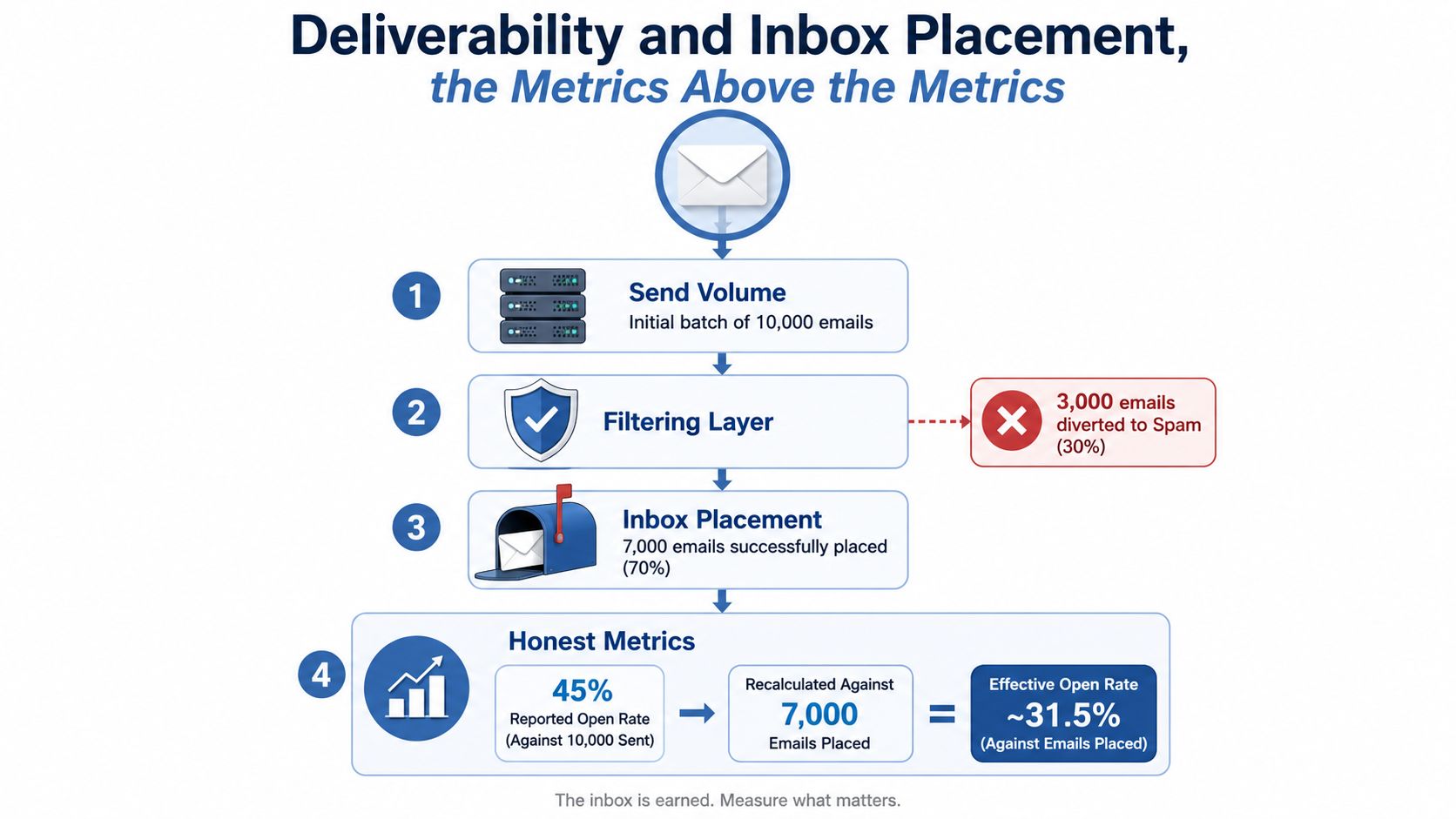
I've seen dashboards brag about strong delivery while the program underperformed. That happens because delivery and inbox placement are not the same thing. The server accepted the message, but the reader never saw it in the visible inbox.
Recent reporting makes that gap hard to ignore. One 2025 to 2026 deliverability report says the global health score was 87/100 but only 66% of emails reached a visible mailbox location, while another benchmark set reported average deliverability around 83.1% (Postmastery benchmark report). That's exactly why I treat inbox placement as the metric above the rest.
The signals I watch first
The technical layer I check is simple. Spam complaint rate, bounce categories, sender reputation, and authentication are the first signs that the program is getting brittle. One benchmark source says spam complaint rate should stay lower than 0.1%, and it also ties low complaint rates to healthier inbox placement (MoEngage email metrics guide).
I separate bounce types too. Hard bounces tell me the address is bad or unreachable. Soft bounces usually mean temporary failure. Block bounces are the ones that make me stop and inspect the sending setup immediately.
For testing, I use seed lists and mailbox probes, then cross-check with tools like a dedicated inbox placement test. Gmail Postmaster Tools and Microsoft SNDS can give you another layer of evidence when you need to see whether a domain problem is getting worse.
Authentication is boring until it breaks
SPF, DKIM, and DMARC alignment matter because they help mailbox providers trust the sender. BIMI is worth adding later if your program is already stable, but I never treat it as a substitute for list hygiene or complaint control. Low adoption of DMARC enforcement and list verification is one reason so many senders still can't trust their own performance numbers, because the infrastructure underneath the metrics is weak.
When inbox placement slips, every other chart becomes fuzzy. That's why I check placement before I check clicks.
Benchmark Ranges You Can Actually Trust in 2026
Batch, automation, and transactional sends behave differently
The fastest way to misread benchmarks is to lump every email together. Batch newsletters, triggered automation, and transactional messages live in different engagement environments, so their numbers shouldn't be judged the same way. A transactional flow usually gets more intent than a weekly broadcast, and the metrics should reflect that.
One benchmark set reports average automation and transactional open rates at 30.63% and CTR at 7.39%, compared with global all-industry medians around 21.5% open rate and 2.3% CTR (OwlClaw benchmarks). That gap is exactly what I expect from triggered messages, because the timing and context are tighter.
What I'd treat as healthy, and what I'd treat as a warning
For batch newsletters, I'd watch for a decent open rate, but I'd weigh CTR and revenue per recipient more heavily because opens are so distorted now. For automations like welcome flows and browse follow-ups, I'd expect stronger clicks and better conversion behavior. For transactional messages, the main question is whether they're creating downstream action without annoying the customer.
One 2025 benchmark set puts average open rate at 43.46% while click rate is only 2.09% and CTOR is 6.81%, which is exactly why asking “what is a good open rate?” can send you down the wrong rabbit hole (MailerLite benchmark comparison). The open can look excellent while the email still fails to persuade.
| Send Type | Open Rate | CTR | CTOR | Conv. Rate | Unsub Rate | RPR |
|---|---|---|---|---|---|---|
| Batch newsletter | Moderate, privacy-skewed | Low to moderate | Moderate | Variable | Low if relevant | Use as comparison |
| Welcome automation | Higher | Higher | Higher | Stronger | Usually lower | Often stronger |
| Browse or cart follow-up | Higher | Highest | Highest | Strongest | Low if targeted | Often strongest |
| Transactional message | Strong | Moderate | Depends on context | Useful but indirect | Very low | Watch for spillover revenue |
The self-check I'd run on Monday
Pull the last 12 sends. Plot each one against the ranges you trust for its send type. If one send sits outside the pattern, decide whether it was a winner to clone or a leak to fix. Don't wait for a monthly review to do that, because the waste compounds fast.
Segmenting Performance to Find What Is Really Working
Aggregates hide the truth
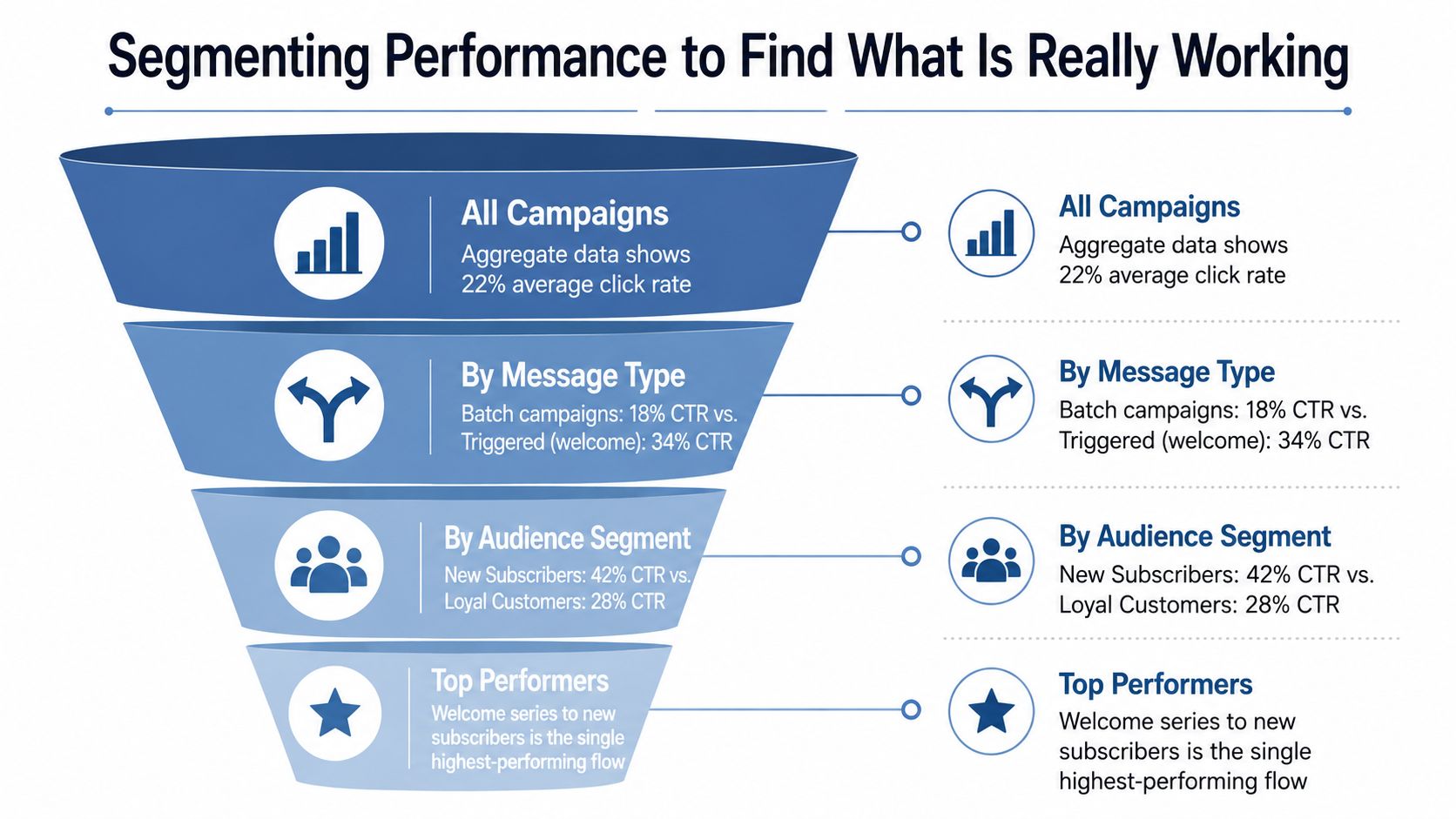
A single average can make a program look healthy while half the list is drifting. That happens because different subscriber groups respond to different offers, cadences, and timing. I've seen one campaign look mediocre overall, then turn into a standout once I split it by audience behavior.
The four layers I use
First, I split by message type, because batch, triggered, and transactional sends belong in different buckets. Second, I slice by funnel stage, which usually means subscriber, buyer, and repeat buyer. Third, I break out engagement tier, active, at-risk, and dormant. Fourth, I isolate cohort behavior, especially the first 30, 60, and 90 days after opt-in.
The point of segmentation is to stop rewarding the average when the average is lying.
That sounds obvious until you stare at a dashboard and realize your worst segment is dragging your best one down. A 28% open rate can be fine in one group and poor in another. The number itself tells you almost nothing without the audience context attached to it.
For a deeper setup guide, I've found this segmentation reference useful as a practical companion when I need to rebuild a view without adding new software.
How to build the view without engineering help
Most ESPs can give you one report with filters stacked on top of each other. I start with campaign type, then add subscriber status, then engagement tier, then cohort date. Once the report is built, I save it and only revisit the segments that move revenue or suppress it.
The signal I care about most here is simple. If a segment consistently produces more revenue per recipient, I give it better timing and a tighter sequence. If a segment keeps underperforming, I stop pretending a prettier subject line will fix a deeper mismatch.
Building a Reporting Dashboard a Solo Operator Will Actually Use
One screen, four tiles, one routine
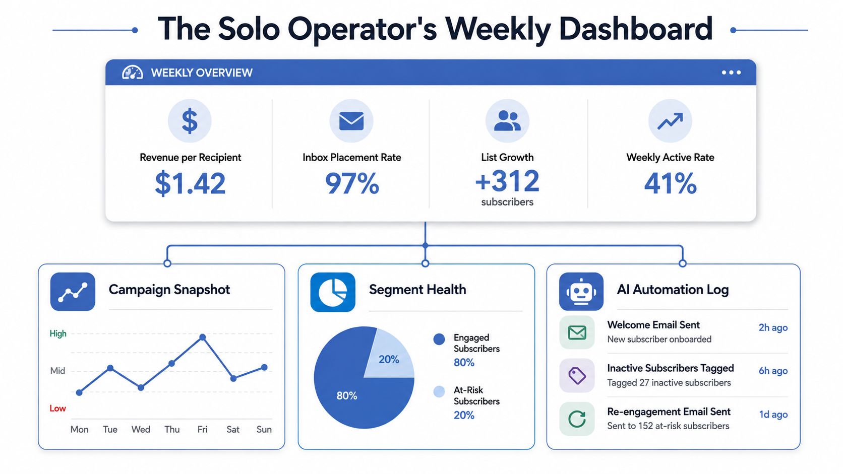
I don't want a dashboard that looks impressive. I want one I'll open on Monday. For a solo operator, that means a single landing view with revenue per recipient, inbox placement rate, list growth, and one traffic light per automation.
The tiles I keep and what they mean
The revenue tile pulls from the ESP and checkout data, because I want the send tied to actual money, not just clicks. The inbox placement tile comes from deliverability checks, because everything else depends on it. The list growth tile tells me whether audience acquisition is keeping pace with churn. The automation traffic lights tell me which flows need attention before I touch broadcasts.
A dashboard that's easy to read beats one that looks fancy and gets ignored.
I also keep a short weekly note under the dashboard. Three lines is enough. What changed, what I changed, and what I'm waiting to see next week.
The Monday routine that keeps me sane
I check inbox placement first. If that's healthy, I scan the four KPI tiles, then open the segment drilldown only if one tile turns red. That order matters, because chasing campaign issues before deliverability is fixed wastes the morning.
I also use alert rules so I'm not staring at charts all day. Bounce spikes, authentication failures, and sudden revenue drops can trigger a ping. Everything else can wait for the weekly review.
A dashboard should reduce decisions, not create new ones.
That's the test I use. If the view doesn't tell me what to do next, it's decoration.
AI Agents and Automations That Act on Email Metrics
The opportunity is faster reaction, not more reporting
The best use of AI here is not another dashboard. It is faster action on the numbers that change revenue. A solo operator cannot watch the inbox all day, but an agent can catch metric drift and start the right response before a bad send turns into a bad week.
I keep the workflow lens tight. Each agent should have an opportunity, a trigger, a process, a data need, a success metric, and a failure mode. If it cannot explain itself that way, I do not trust it.
Five workflows I'd build first
Inbox-placement monitor
A placement drop needs a faster response than a weekly review can give. When inbox placement slips below the normal baseline, the agent checks authentication, reviews recent sends, slows volume on the affected domain, and runs a test batch. It needs domain, segment, send volume, and complaint data. Success shows up in restored placement. It fails when a content problem gets treated like a technical one. For a practical example of an AI helper built around inbox management, see this email inbox management agent guide.Subject-line tester
A scheduled campaign with two approved variants is enough to start. The agent sends a small test group, picks the winner, then rolls it out. That saves time on manual A/B setup, but it still needs subject, preview text, list split rules, and engagement history. I wrote about this kind of system in Bionic Business a few weeks ago, because it is one of the easiest places to let AI handle the boring work. The weak spot is overfitting to tiny samples.Segment rebuilder
Stale segments drag down revenue fast. When engagement falls or repeat purchase stalls, the agent rescans the segment, moves inactive people to a lower-frequency path, and surfaces high-intent subscribers for stronger offers. It replaces spreadsheet cleanup. It needs last open, last click, last purchase, and product interest. Success shows up in higher revenue per recipient. The main risk is scoring drift.Send-time orchestrator
Some sends fail because timing is wrong for the list, not because the copy is weak. If complaint rate rises or engagement falls by domain, this agent throttles sends, shifts timing by segment, then retests. It replaces batch scheduling. It needs mailbox domain, engagement time, complaint rate, and recent open and click patterns. Push the throttle too far and momentum dies.Revenue-per-recipient alerter
The cleanest way to stop a weak automation is to watch the floor. If an automation falls below your revenue threshold, the agent alerts you, pauses the flow, inspects copy and offer, then relaunches only if the math improves. It replaces weekly postmortems that arrive too late. It needs recipient count, revenue, and automation name. Success is a lift in revenue per recipient. The failure case is pausing a sequence that still helps retention.
I keep the field list minimal. Name, email, segment, source, last open, last click, last purchase, and order value go a long way if you are building this yourself.
What to Change on Monday and the One Number to Track
A 90-minute checklist is enough
Monday morning, I'd split the work into three blocks. Instrument, analyze, act. That keeps the session tight and stops the week from disappearing into dashboard drifting.
In the instrument block, make sure your ESP logs delivery, open, click, and conversion with an order ID. Add consistent UTM naming, and keep your suppression lists current so dead records don't pollute the data. If the events aren't clean, the metrics won't be either.
In the analyze block, pull revenue per recipient by segment, check inbox placement risk, and look for segment drift. Then compare the last week with the one before it, because a one-off spike or dip can be a bad signal. I'm only interested in movement that changes a decision.
The three actions I'd allow before lunch
If a subscriber has been idle for 120 days, I'd fire a re-engagement flow. If complaint rate goes above 0.08 percent, I'd hold the send. If an automation earns below the channel's revenue-per-recipient floor, I'd pause it and inspect the offer.
That's enough to keep the account from drifting into self-inflicted damage.
The number I'd put on the wall is revenue per delivered email per segment per week. It beats open rate because it ties the send to a person, a segment, and a result you can bank. If that number rises, the program is doing useful work. If it stalls, the dashboard is telling you where to look next.
If you want to rebuild your email reporting around numbers that move the business, start this week with one dashboard, one segment view, and one automation trigger you can trust. Then open Bionic Business at bionicbusiness.com when you want the next practical system, not another theory thread.
Frequently Asked Questions
What are the most important email marketing performance metrics?
Revenue per recipient and inbox placement tell you the most. Delivery rate works as a gate, click-through and click-to-open rate test the content, conversion rate is the business outcome, and unsubscribe and bounce rates are hygiene checks. List growth rate shows whether the top of the funnel is feeding the bottom. If a metric does not answer a decision, stop tracking it weekly.
Why is email open rate unreliable?
An open is a tracker event, which is different from proof that a person read the email. Privacy features, image prefetching and automated inbox behavior distort it, and one benchmark source notes Apple Mail Privacy Protection can inflate reported opens by 15 to 20 percentage points. Two campaigns can show the same open rate and earn very different revenue, so use opens only for subject line and send-time tests.
How do you calculate revenue per recipient for an email?
Divide the revenue a send generated by the number of recipients it was delivered to. Revenue per email is similar but divides by emails sent. Revenue per recipient is the better number for comparing sends of different sizes, because a campaign sent to 2,000 people cannot be judged fairly against one sent to 20,000 on raw clicks alone.
What is the difference between email deliverability and inbox placement?
Delivery means the receiving server accepted the message. Inbox placement means it landed somewhere the reader will actually see it. A dashboard can show strong delivery while the program underperforms, because mail is being filtered away from the visible inbox. Check placement with seed lists, mailbox probes, Gmail Postmaster Tools and Microsoft SNDS before you look at clicks.
What spam complaint rate is too high?
One benchmark source says spam complaint rate should stay below 0.1%, and low complaint rates line up with healthier inbox placement. A practical trigger is to hold the send if complaints go above 0.08 percent, then check authentication, bounce categories and recent sends before you bring volume back up.
What should a solo operator’s email dashboard include?
One screen is enough: revenue per recipient, inbox placement rate, list growth, and a traffic light for each automation. Check inbox placement first, scan the other tiles, and only open the segment drilldown if a tile turns red. Add alert rules for bounce spikes, authentication failures and sudden revenue drops so everything else can wait for the weekly review.